psst
they’re legos. add more bricks.
psst
they’re legos. add more bricks.
Zero, I was thinking of picking this set up, using it to make a corrected Ecto and sell off the figures to recoup some of the cost.
I believe this is due to the printing process and color order.
Generally you want to print white last (dark colors first), so they lay the base down with black first. Then follow with red. Then add the white on top.
It may also depend on what color the decal sheets are too. They may be black by default.
man… it’s crazy how they captured Melissa McCarthy’s likeness with only a couple lines.
It really looks like her.
Yep. You’re right. 100%. Have a crunch bar.
Having some insight into printing, I was going to address the logo in a similar fashion.
In early comic art, thick black ink lines were apparently used to conceal the minor overlays between the colour layers created by the printing process - it was a good theory, although as some vintage… and even some rare instances with modern comics show, the process can end up overlaying the colours incorrectly rather badly.
I imagine it’s the same case with LEGO’s brick printing, and that as they had to add a black outline to the ghost portion of the logo, they decided to go the extra distance and add one to the red prohibition circle. (Although I believe it’d be a layer of red first, followed by the black outline, with all of the white being supplied by the brick)
It’s a minor detail, and not one I believe detracts from the set (and as pointed out, this same version of the logo appears on the '59 Cadillac set, the Firehouse, and on the Ghostbusters themselves (in the Firehouse release, and the LEGO Dimensions set).
At least the ghost has its chin, unlike on the Hotwheels Ecto. 
I’m quite impressed how well the design of the Pack lends itself in LEGO form.
Looks like I’ll be one of the few who’ll be buying it not to use it for spare parts. 
You’re not the only one. I literally cannot wait for this set. It’s super cool and I think the packs on these look a smidge better than the classic set.
First look at the trap? O’course it had to be in lego with no real details lol Might be a grenade but the design doesn’t match up all that much.
That’s my thought as well. They’re too big to be grenades even for lego. Plus they have grenades printed on one of the uniforms
I also spy the 2016 PKE, probably a Proton Pistol, and maybe some Ecto Goggles.
I’ll just leave this here. http://www.licensing.biz/news/read/warner-bros-revs-up-licensees-for-batman-v-superman-and-dc-super-hero-girls/043303 :walterpeck:
While not truly based directly on a film (as in all characters in a film) it is of a commonly male brand being promoted to girls. Sort of the flip of Mattel’s Ghostbusters 2016 movie line. :love:
The Lego trap looking thing goes along with what I’ve heard the traps look like in the film… more of a cylinder, beer can looking thing that opens on the end. Also, could the transparent turquoise thing be a trap full of slime? Maybe these things have are partially transparent, not unlike the ooze canisters in TMNT?
That was my thinking, or they start partially transparent and become “solid” when occupied.
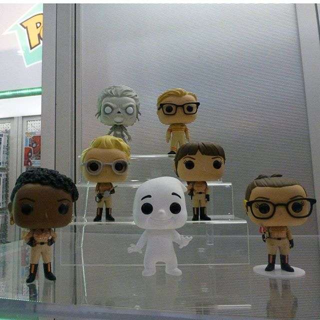
This movie is gonna cost me a ton… Those pop figures are awesome.
I wanna know who/what the baddie is. Maybe their version of the Library Ghost or Slimer i.e. the first one they see/capture?
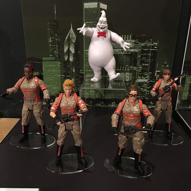
The creepy ghost vinyl pop is named Gertrude Eldridge in the support material, and I wouldn’t be surprised if she was the ghost from the haunted house the Ghostbusters visit.
It also looks like the logo ghost shows up briefly as a character, and his name is ‘Rowan’.
Ooookkkaaayy.
[spoiler]
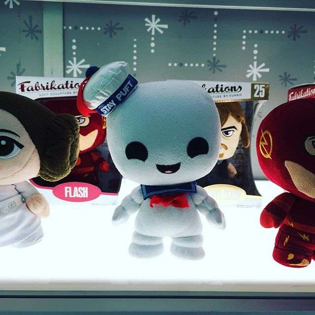
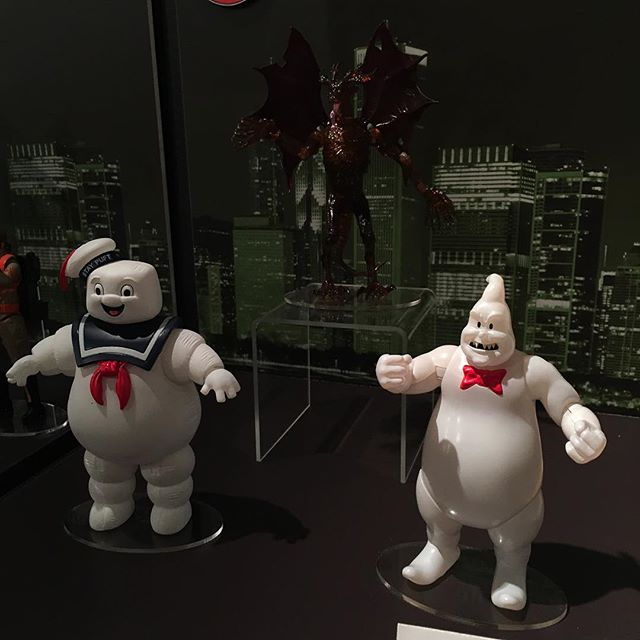
Stay Puft, a “scarified version of the no-ghost?”, and what looks like Lego Red Daemon’s actual figure.
The prototypes again.[/spoiler]
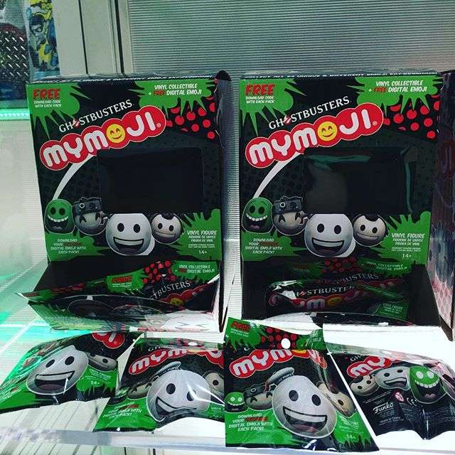
Mystery Box for the original movies.
EDIT: (To actually add to the conversation)
I wouldn’t be surprised if the logo ghost “Rowan” is the library ghost type encounter. He looks sweet and innocent until they ■■■■ him off and goes all Eleanor Twitty. They they use his likeness for the logo as its the first ghost they ever encounter.