Anyone have luck finding the new tShirts?
I been to a few Targets around Pittsburgh, but I’ve failed.
Anyone have luck finding the new tShirts?
I been to a few Targets around Pittsburgh, but I’ve failed.
Walmart has the no ghost symbol on a shirt but he is flexing also another one just with the no ghost
That doesn’t sound like it’s specifically a bit of merchandise for the reboot, just a general Ghostbusters T-shirt.
On the Ghost Corps facebook, they did say it was test run and they might go for sale on the Target website, too, so it’s worth checking that out every so often as well.
I’m sure every store will be selling GB T-Shirts toward summer. When Jurassic World came out you could find Jurassic Park shirts everywhere.
Totally… I’m just impatient.
The official gb store has the Kristy Kreme shirts, $10 each or both for $18…that’ll tide me over.
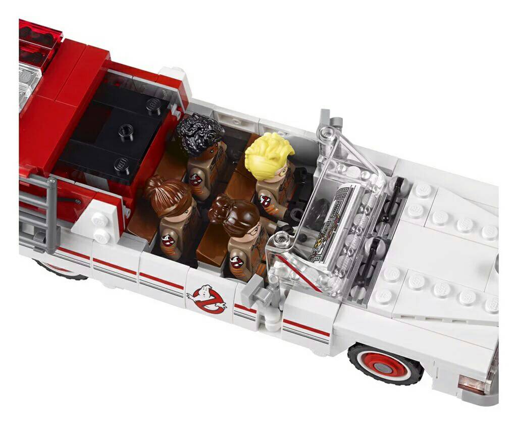
Door logo is inaccurate.
And with that, we really have the most inane gripe you can come up with.
For Christ’s sake its all still in a prototype stage, and even so, you’re really THAT upset with a freaking black outline?
If you want to go with that, then the Ghostbusters are inaccurate too. They don’t have LEGO shaped bodies. And the stripes should go all the way around the arm. And Patty’s necklace is inaccurate! It only says “P” not “Patty” like in the movie! And Kevin’s hair is parted the wrong way! And don’t even get me started on the roof rack! lol
I mean come on man… talk about nitpicking.
The set looks good. Actually looks like it has more features (opening doors) than the current Ecto.
Definitely gave away at least one spoiler with the reveal of the set about Kevin, but if you saw any set videos than you already knew that one.
I think the overall quality of the set is pretty good. I can’t help but wonder which one of the little extras is the new trap and how this “Red Daemon” will translate onto a screen. I would honestly be surprised if Lego Dimensions doesn’t get a reboot level pack.
The red ghoul seems to have some asian design to it… Wouldn’t be surprised if this is the first ghost they come across at the Chinese restaurant they share space with.
It’s an easy cosmetic fix to make something that much more accurate to the screen. It’s not a big deal…just ■■■■■■■ lazy. I would change it myself if I choose to get it…but I shouldn’t have to.
There are several threads about door logos on this forum and you wanna rake me over the coals on this one for my opinion? 
So then to be clear, did you have an issue with the inaccurate door logo on the first LEGO Set? Or the Firehouse set?
After all, both of those LEGO sets had a black outline on the GB logo, and neither of those items had a black outline in the movies, right?
And I’m not raking you over the coals for your opinion. But when that’s literally the only thing you post, and it’s such an absolutely minor irrelevant thing to gripe about, sorry, but I find it annoying. Especially if you don’t have the same opinion about the other LEGO items, because then it just seems like reboot hate for the sake of reboot hate.
The logo on the reboot Ectomobile and suit patches is actually SLIGHTLY different from the standard branded logo. It’s a tiny nitpick. I’m REALLY digging this set! The red demon dude looks awesome!
So how come the reboot Ecto makes it so you can fit all 4 figures in it but the Classic Ecto doesn’t? Can we get an updated reissue?
Just make Ecto 1A with room for all four. Please, please!
I might just get 2 to update the original!
E7, that seems to be a lot of people’s idea as well. at least buying the set to correct the original.
Well, the only issue with correcting the original, is I’m guessing it’s going to be at least a couple of bricks wider, which would mean it won’t fit into the firehouse doors. I know it doesn’t fit all the way in as is, due to the desks, but I like the display of it parked half-in half-out… this would prevent that I’d guess.