Florida variant GB suit (Wii edition)

So I’ve been going through different plans of color schemes for a non-khaki non-RGB and non-charcoal suit. I remembered in the video game opening cinematic hearing Venkman say something like “Franchises available soon”. This made me think a green suit for Florida would be cool and an addition to the “No Ghost” with the name of the state under it.

Tell me what you guys think. I also messed around with other colors with the variant storm flap shoulders/collars like in the PC/360/PS3 versions in multi-player mode, but I like the one uniform color. With this suit I plan on making Wii gear, hence the knee pads and different belt.

I think it would be kinda awesome to help set up a state-wide accepted variant or something, though, chances are this will only be me and some friends. :whatever:

Looks good.

As a big fan of green, I may have to make a suit to look like that.

XD

For the AZGBs, we put our state flag inside the circle part of the logo. Unfortunately, it doesn’t work for every state’s flag, but it might be something to try.

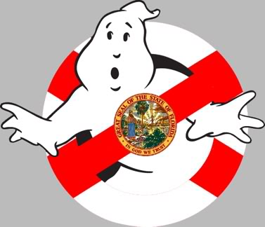
Yeah I tried that. We have a seal in the middle of our flag so it becomes a mess :frowning:

Well with our Franchise,we just did a vector of the upper portion of FL,and added it onto the existing No Ghost,its my sig and avatar pic.

Maybe you could put the Florida lettering inside the red circle?

I like this idea. I like the one I have, too. :slight_smile: Its hard to incorporate the state shape or flag into something I like. I was thinking maybe having the full state behind the noghost. I’ll post some logo sketches later.

Edit: I think I also may go with black pads and belt.

We had the problem of what to do with the star. Inside the lines it was too small. Our member Esther got it just right.

I did a florida logo where the ghost is holding florida as the cross, I will also add it’s hard to incorporate such an odd shape, the diff color idea would be cool for uniforms, it would just be a pain to designate the colors

Well going with what Jetta said about the AZ logo, I came up with this. Its decent, but I may wanna go a different route.

I almost wish out state flag didn’t have a seal on it. :confused:

The concept is good,but the white on the bottom of the logo blends with the ghost,maybe do an outline around the NO Logo itself.

It does look good but the seal is too busy for it to be on something like a shirt or patch.

Yeah thats exactly what I was thinking, “how am I going to get this embroidered and not have the seal look like ■■■■?”

I like it !

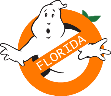
I tried simplifying the seal and it looks dumb. So far its between the one saying “FLORIDA” and the flag version.

make the logo orange, like an Orange. Florida!! :lol: :wink:

That is not a bad idea! :slight_smile: Keep it simple.

Edit: I guess I should get my nametag with orange text to match?

I did this one as a joke, but its growing on me.

Hrm. Add some more orange shading and texture to it, looks a little - peachy.

Agreed,more orange and see if you can’t try to get the texture close to an Orange peel,then you’ve got a cool new Florida based GB logo.

Only for the graphic version, any more detail then that wouldn’t really show up if he were going to try use it to get a embroidered logo made of it.

I like it, simple and to the point, but nicely unique to the Panhandle Ghostbusters.