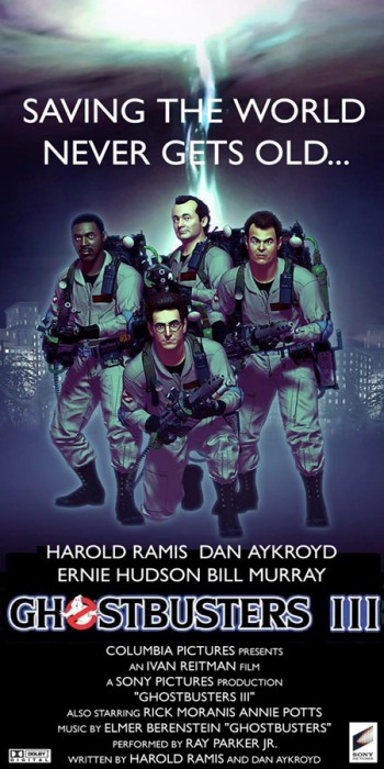
made a poster from the background pic that you see on the PS3:

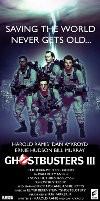
made a poster from the background pic that you see on the PS3:
The tagline quality’s good, if just reusing the Ghostbusters II tagline… but the quality of the billing block at the bottom is quite ugly. 
you must not be a fan of the original GB poster then either, it has a similar font. And for the tagline, if ain’t broke, don’t fix it. Couldn’t really think of anything else that had a nice ring.
I think Ben is referring more to the picture quality and resolution of the bottom half…Not the font itself…
And on another note - Dammit you took my idea ;-)…Though mine was going to say like “GB 2.5”, or at the very least “GB:TVG”  …Still gonna do it mind you :-)…
Cheers.
oh and FYI, that’s actually not the tagline for the GB2, it was “guess who’s back to save the world.” and also “we’re back,” just so you know.
Even though the tagline isn’t officially GB2, it’s too commonly associated with the movie, so I changed the tagline and also improved the resolution of the bottom lettering.

Grainy marquee = Bad look.
another touch up on the poster, also another version with a different marquee, more in keeping with the original movie posters
Looking much better. I love the blue glow better than the plain text.
Also, your image has odd cut-offs on the bottom by the text. You might wanna just trim the bottom of the image so it’s even.
But great work so far!
i can’t really see what your talking about, are you talking about the lettering at the very bottom of it all?
If you look at one of the larger images, next to the “H” in Harold’s name, you’ll see the blue background of the actual image get cut off at a 90 degree angle. Also, if you look inside the “D” in “AYKROYD” you’ll see some irregular blotchiness of the blue background. It’s harder to see in the smaller images, but it’s exactly the same.
I know it’s minor stuff, but might as well go for the gusto! The posters are already quite nice - should give it 100%. =)
Oh ok, I’ll take a look at that right now and fix it, i mean I’ve corrected the other stuff people mentioned, if I’m gonna do it, might as well do it right. Thanks.
Any chance you can make larger versions of the smaller two? VERY nice work!
OKay I see what you’re talking about, I really had to look but now I see it. Whatever that is I didn’t do it, at least not directly, i think it’s some kind of rendering glitch or something. I’m thinking it might just have to stay this way. I adjusted the brightness/contrast settings but I didn’t seem to make much of a difference. And the blur filter on photoshop just ruins the whole thing.
no problem, I have them uploaded on deviantart.com
these links should take you right to them:
http://maldo71.deviantart.com/art/GB-3-Poster-Old-Marquee-129317663
http://maldo71.deviantart.com/art/GB3-POSTER-2-129276061
once you get to these pages, look at the left side of the picture, and you will see different icons, look down the list until you see the one that says “download” and that will give you full resolution size. both posters are 600x1200
Made some more improvements, found a hi-res no ghost logo I was able to insert into the marquee, some hi-res Sony and Dolby logos, and also added the no ghost logo up top. I have a few version I will add to my gallery on my profile but this is one of them:

Now it’s squished.
There’s no way Elmer Bernstein can do the music for GB3 unless they use the same music from GB1, Bernstein died in 2004. His last name is spelled wrong on your poster.
Guess it’s a good thing it’s only a pretend poster, close call.
Ahahahaha. I feel so much better about today now.