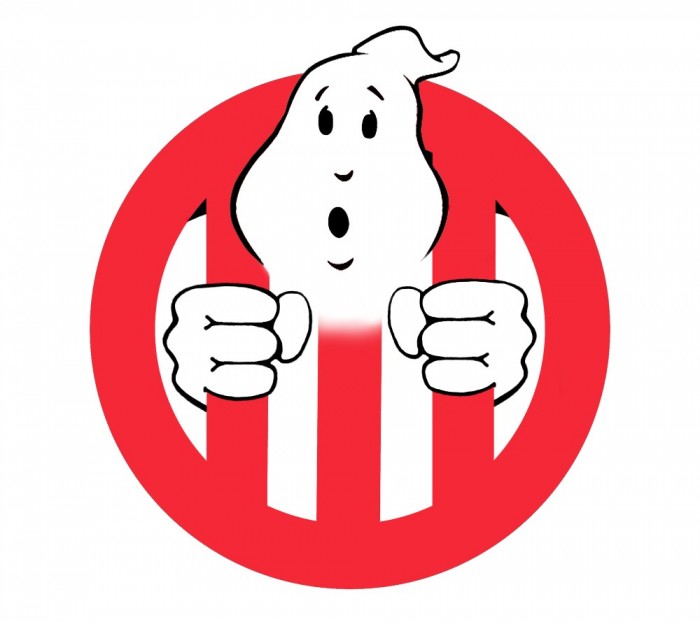
Hi all! So I know a lot of us are tired of all the Ghostbusters III rumors. What’s even more annoying to me, however, is that poorly Photoshopped Ghostbusters II logo, altered so the ghost is throwing up three fingers instead of two. I know we Ghost Heads are more creative than that junk, and I think we should flood the Internet with original designs for a new logo. Heck, maybe the next time we see the umpteenth rumor of a possible director/writer/actor/etc., the site will use a different art piece. Or maybe we can just all have fun and draw cool stuff. Either way, we win.
Here is my design. Before you say anything, yes, it’s very flawed and not good. I only included it to start the show. I’d LOVE to see your all’s logo design (whether you think a third movie should be made or not). You can even do a new take on the original logo. The sky’s the limit!

1 Like
I honestly would love it if they went back to the original GB1 logo and kept it as that for the rest of the franchise. That’s what they did for the comics and video game so I think it’s a smart choice…
but I would LOVE IT if the film just had “G3” as the main marketing logo for the movie. Posters and toys and t-shirts and everything… much like what Terminator 2 did with it’s huge T2 blow up…
Just a black poster with a G3 in white with a red stroke/fade around it and then a small month/year for a release date on the bottom would be enough for the world to get a hard on for.. it would also show a real modernized approach for the franchise to “reboot”
I say stick with the original logo.
Dang. Looks like my image was lost. Here it is again:
Haven’t posted in a long while, but here’s one that I did a few years ago:
Every Ghostbusters 3 logo is unofficial…