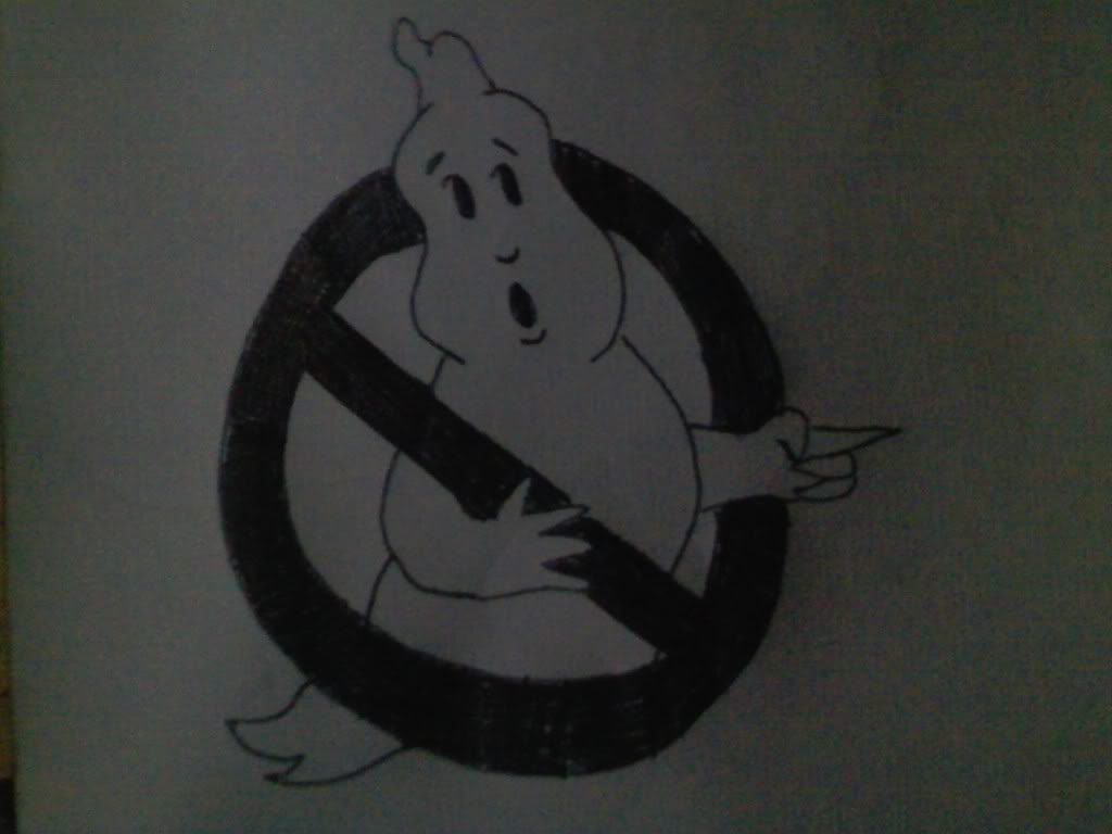
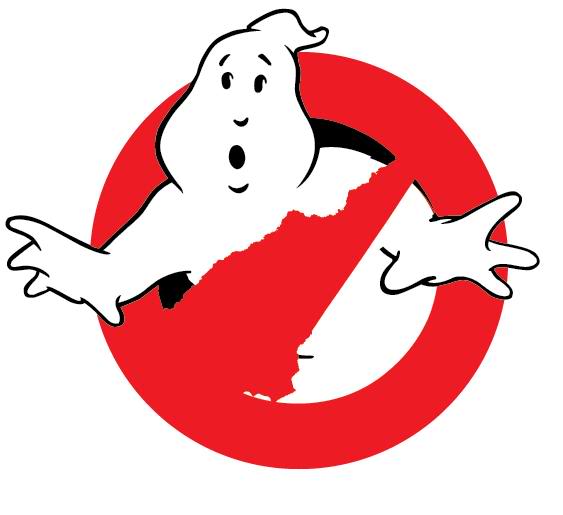
Wanted to try a different logo, there is only so much you can change on the original logo and have it stand out.
Do we love it? Do we hate it? Let me know, things can and will be changed to please the public!
Wanted to try a different logo, there is only so much you can change on the original logo and have it stand out.
Do we love it? Do we hate it? Let me know, things can and will be changed to please the public!
I also just came up with this one, where the busted ghost is subtly shaped like New England, right now. I did a quick sketch before I make a larger one tomorrow when I’m fully awake. After I started drawing the “No” circle, I realized you can’t tell what he’s shaped like, but this will give you the basic concept until later. Feedback on both is appreciated!