There’s nothing WRONG with it, as long as you don’t have any issue with it being inaccurate.
Joey’s stuff is still the most accurate out there. If his name patches aren’t listed in his shop anymore, I’d send him a message on etsy asking him to make you some.
Haha, I forgot about that. Hmm, I had been leaning towards Wingerden (assuming it could be done without the letters looking too ridiculously squashed), but now Cross is gaining some extra appeal…
I want to point out I’m not out to cause an issue on the subject, I’m just curious as to how it is inaccurate? Seriously I can’t 100% tell. Is it a spacing issue? Because aside from the J in the JONES tags pictured in your post from above the font looks pretty much the same to me and the only other difference I can see is JoJo’s letters are closer together than Katara8’s. I’m just looking for clarity on this subject.
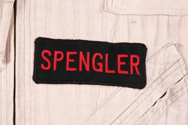
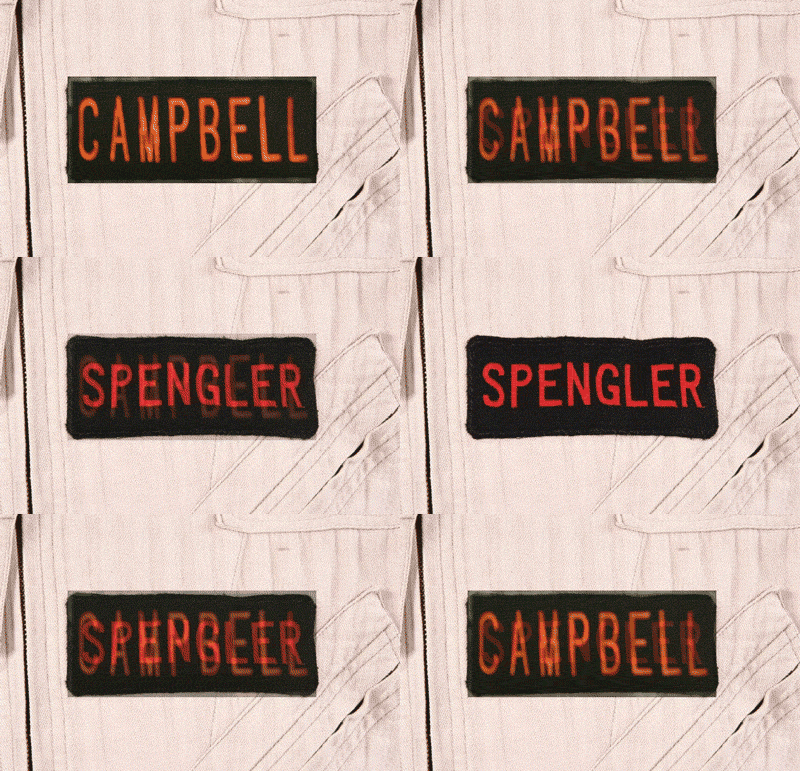
Katarra’s tag, compared to the real deal, differs in these ways:
The font is totally wrong. The letters are the wrong weight. The letters are stretched vertically. The character spacing is too wide. The patch is too tall. The corners are straight and not rounded. The black border is too thin.
In a word, nothing about Katarra’s patch is consistent with the screen-used patches:
As was said, there’s nothing wrong with it, per se. It’s recognizable as a Ghostbusters 2 nametag in that it’s black with (relatively) small red embroidered letters. If that’s what you’re after, Katarra’s GB2 patches are just fine.
Personally, I think they’re ugly, and that doesn’t even have anything to do with their inaccuracies. The font is ugly and generic, the spacing is wide and inconsistent (less spacing between the letters and the edge of the patch than between the letters), the proportions are displeasing to my eye, and the stitching looks rough and uneven.
No one can tell you what patch is right or wrong for you, but that nametag looks nothing like the real deal.
Thanks for the explanation Jairus, I’ve asked the same question a few times (although not in this thread) and never been given more than along the lines of “their not done right” as a response so I bought one and was left scratching my head as to what was wrong with it. I even looked in the reference section in the Uniform Screen Grabs, Ray’s Uniform From GB II and Planet Hollywood New York sections and none of them really have a close up of the tags to go off of. So again thanks for expalining it.
Did he say if when got his machine up and running and if he could find another supplier if he’d be doing them again? And if Joey is out for the time being and Katara8’s aren’t as accurate as I thought, is there anyone else out there who does the GB II tags? I’m in no rush cause it’ll be a couple of months before I’m ready to put a Khaki & a Charcoal Grey flight suit together, but it’d be nice to know that there was another accurate supplier out there.
None that I’m aware of. In that case, if joey is out of commission, I’d probably just use a katarra one temporarily until a better one is available. It was a good while before joey started offering GB2 (he used to do only GB1) so up until he came along, there was really nothing out there. Believe me, I looked.
If I had the money, I’d like to invest in an embroidery machine and start supplying properly accurate GB1 and GB2 patches and nametags. There’s a distinct lack of suppliers within the community on that front.
Yeah…was thinking that too Jarius. If i could scheme a way to make it profitable beyond just gb patches I think id invest. There are a lot of custom patch dealers out there…
Sent from my DROID RAZR using Ghostbusters Fans on Android
Indeed. The problem lies in that somebody who makes a living making custom patches is certainly not going to buy a membership to GBFans just so they can advertise items that they sell elsewhere… as we found out previously…
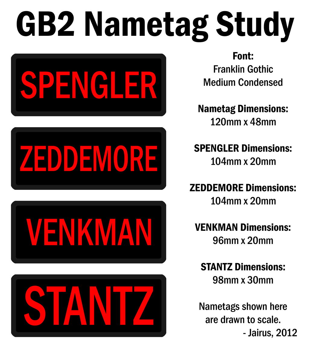
This is the result of taking many reference shots, screen caps, etc., and scaling them all against objects of known dimensions (LC-1 shoulder straps, 3" black belts, etc.). It appears all the nametags were the same size, with the names adjusted to fit the tags. “Spengler” and “Zeddemore” share the same dimensions all around, “Venkman” has the same character height, but slightly narrower overall name length, and “Stanz” was blown the hell up.
Maybe with this floating out there, it will be easier for anyone with an embroidery machine to do accurate nametags. The homework’s been done.