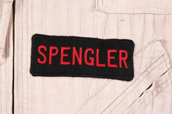
Indeed. The bar and downward spur on the ‘G’ aren’t the right shape, the bowl of the ‘P’ is too large, and the ‘S’ should have horizontal stroke ends, among other proportional differences.
The original font is likely some obscure Akzidenz Grotesk descendant, perhaps even something proprietary to the embroidery equipment. Franklin Gothic is simply the most widely-available font in that family, and a great deal better than Arial, which has, until now, been considered the closest match.
I’m still searching for an exact match, but if that search yields nothing, I’ll probably end up making a font from scratch like I did with the GB1 nametag font.
Here is what I came up with. I modified a font to make my own alphabet that matched the movie tags best I could. Ernie’s more recent photos helped a lot.
It looks like the space between the curve and downstroke on the G on Egon’s nametag is filled in, if you haven’t already sent the font to anyone, there should be enough time to tweak that detail.
If you look at the larger resolution photo, it doesn’t look like it’s filled in; the downward spur is just very close to the curve of the ‘G,’ and the overall font weight is a bit heavier:
The font looks great, particularly the shape of the ‘P,’ though the serifs on the ‘I’ look a bit out of place to me.
On another note, I don’t think the original GB2 nametags varied in width like their GB1 counterparts; all the ones I’ve scaled and compared seem to the be same width and height, with the characters squeezed in or stretched out to fit.
Thanks, guys Yeah this is the font Joey/Pepi is using. I kept the I the way it is just cause that was from the font I used. I figured since the game had that serif I for the first movie font I’d keep a similar thing with this font. With the name tag width, I dunno about the other guys’ and I could be wrong, but Ernie’s looks kinda long.
Most of the complaints I’ve heard about Katara8 have to do with her GB 2 related items like this one
The above is from the first page of this exact topic, and as you can see Jairus did an overlapping comparison of a picture of my Custom GB 2 Name Tag from Katara and a screen used Egon tag.
And then there’s this monstrosity of hers:
As for her GB 1 stuff I don’t here many complaints.

 Yeah this is the font Joey/Pepi is using. I kept the I the way it is just cause that was from the font I used. I figured since the game had that serif I for the first movie font I’d keep a similar thing with this font. With the


