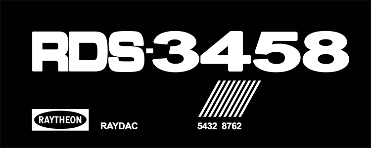
Ecto-1A Equipment Labels

As many of you know, several of the exterior labels on the Ecto-1A are either badly faded or missing entirely. My goal is to create a set of labels for the community that can be used for replica Ectomobiles, model kits, or even a possible community-driven restoration of the screen-used car.

For more information on the Ecto-1A in its current condition, please take a look at this page: http://ecto-1a.gbfans.com/

The first thing is to determine is what labels have been on the car. I’ve been going through the handful of images that are publicly available:

Green Box
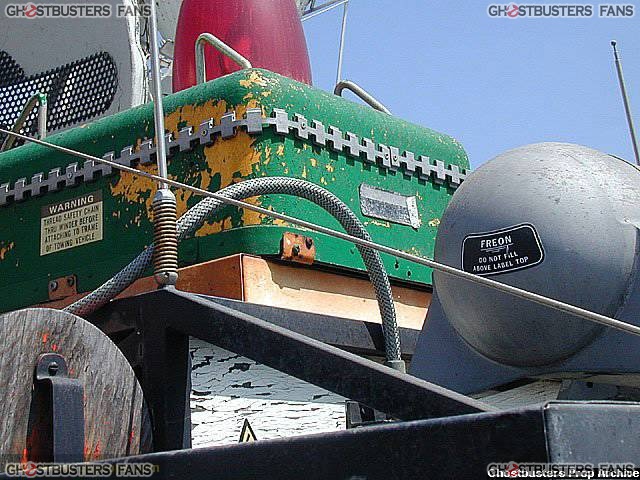
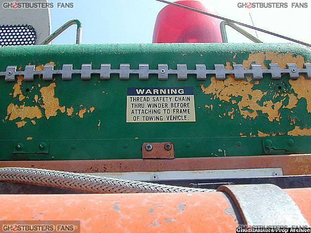
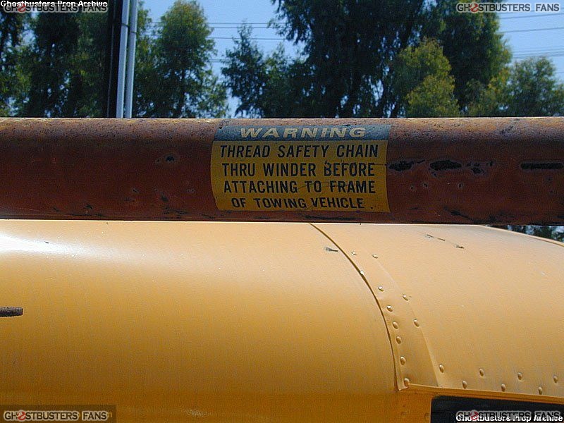
Both the left and right sides of the green box have a “WARNING - THREAD SAFETY CHAIN…” label (as seen on the Sniffer tubes on the Ecto-1). There is also one of these labels on the Sonobuoy.

The badly faded black and white label on the front of the green box appears to be similar to the label on the console behind the driver/passenger seats inside the cabin.
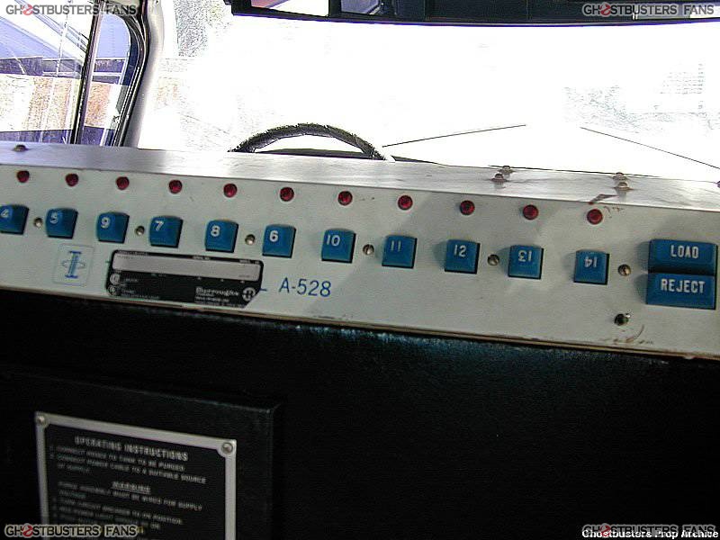
This is the best photo that I’ve found of this label, so recreating it might be tough. If only there were a higher-resolution version of this image available…

Sonobuoy
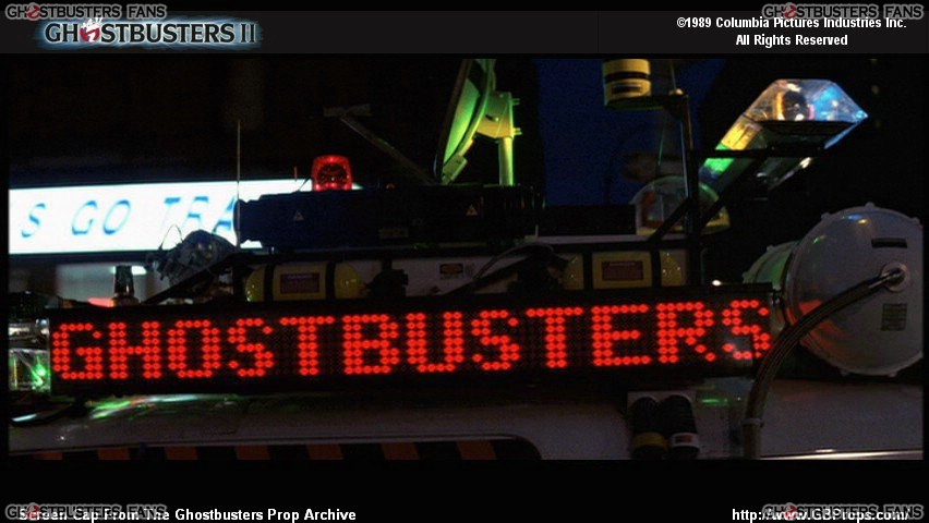
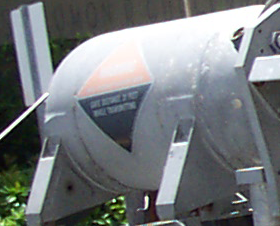
The Sonobuoy had two triangular electric shock labels during the original filming in 1988. These labels have been missing for many years. Also note the labels on the yellow side tanks - these are also long gone.

Red Side Tube
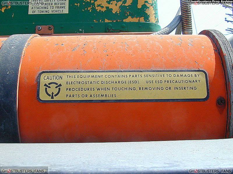
This label appears on the red tube on the passenger side.

White Central Box
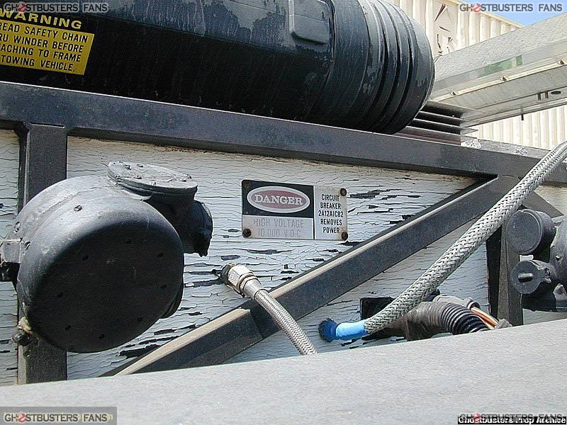
There is a “DANGER HIGH VOLTAGE 10,000 V.D.C. …” label on the driver side.

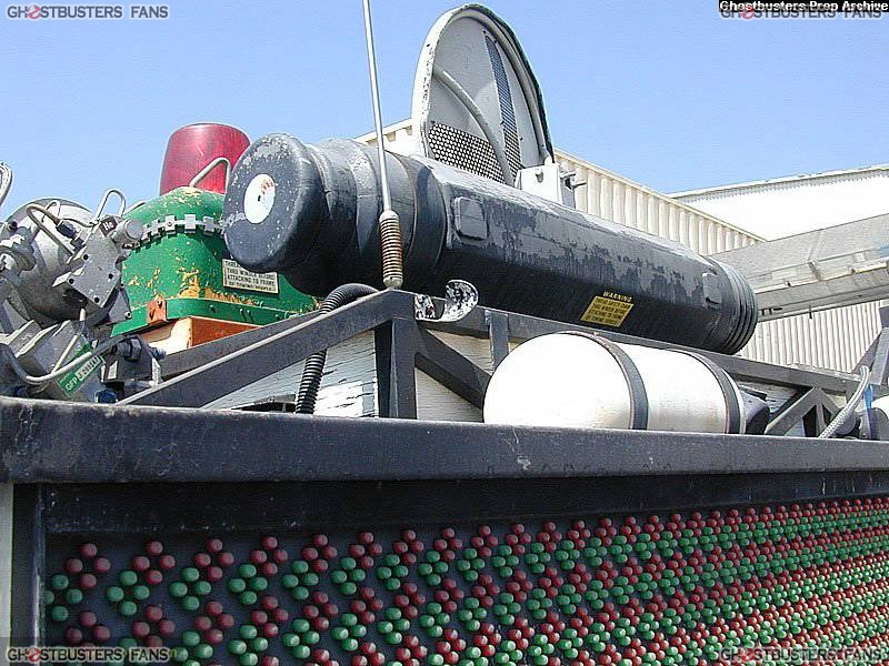
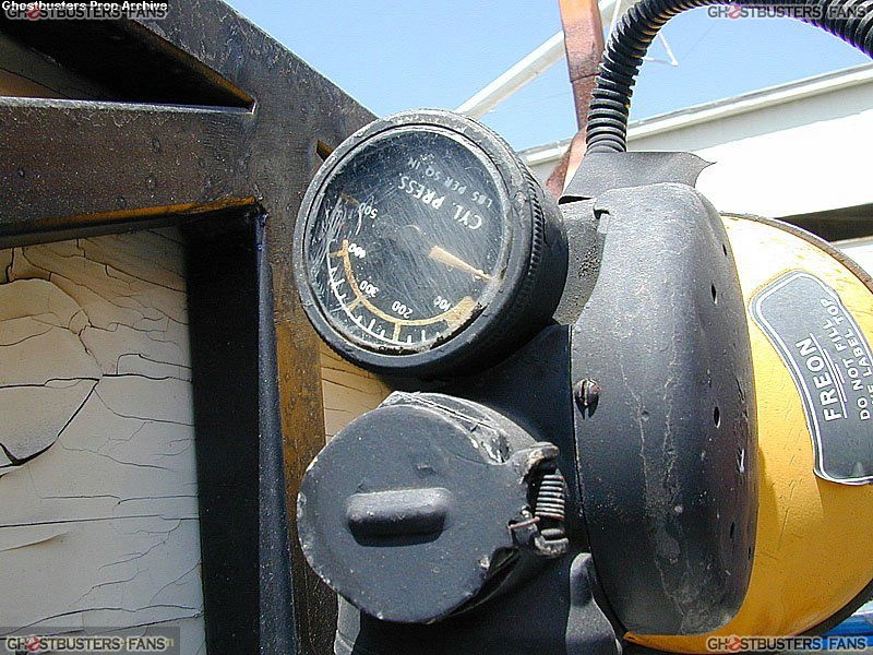
There’s another triangular electric shock hazard label on the front passenger side of the box. Note the “FREON DO NOT FILL…” label on the tank/device directly in front of the white box.

The other side of this device has green label looks like it might read “GFP 3 211142”. It also looks like there’s n “He” or ■■" on this piece.

Rear Tank
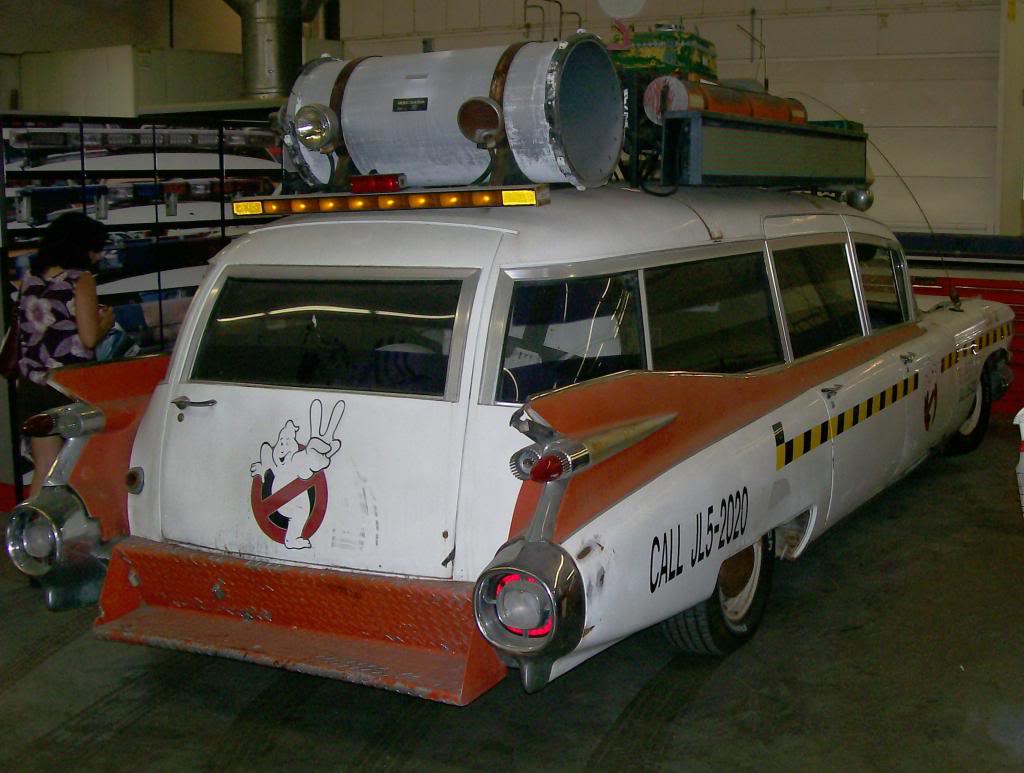
The rear section of the tank has a cut-down version of the computer monitor label (see below), as well as a small faded label above it.
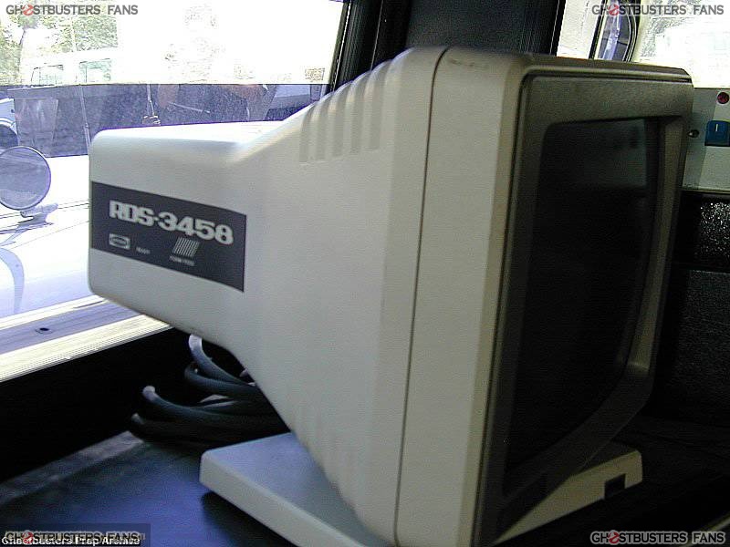
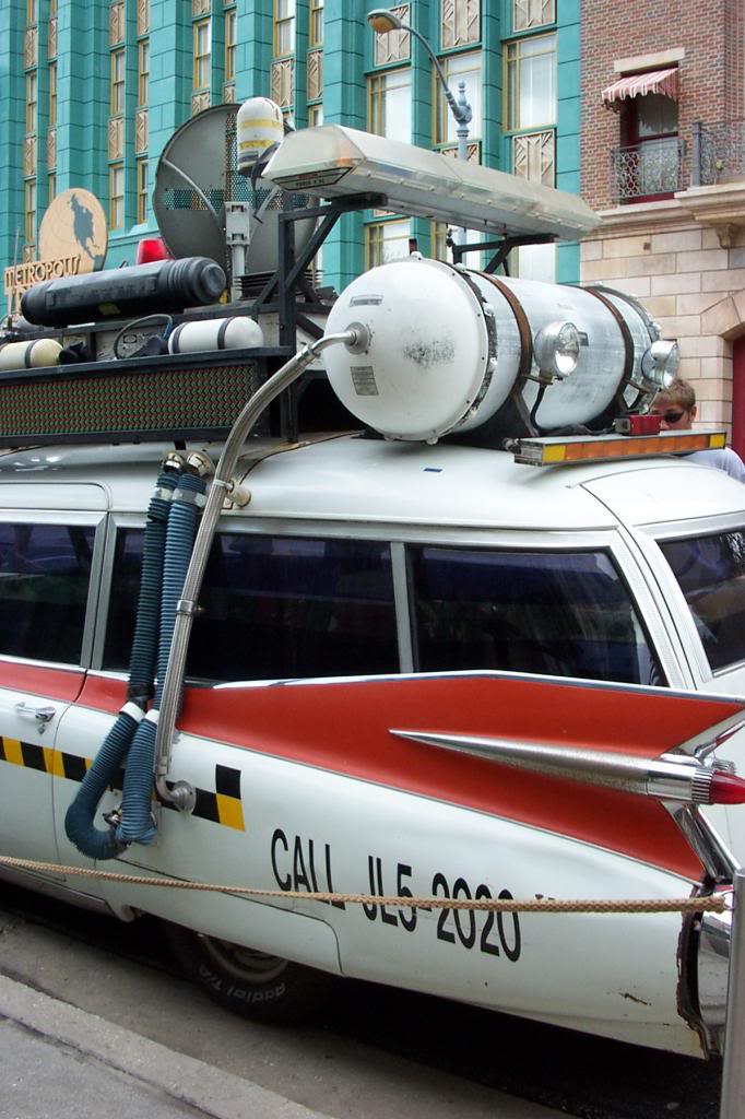
The topmost label on both the left and right sides appears to be the same as the one on the front of the green box and the control panel behind the driver/passenger seats. The Radome might also have the same label.
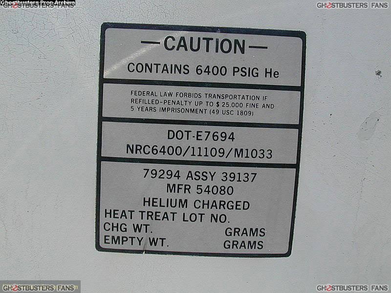
This label appears on both the left and right sides of the rear tank.

I found a few images via Google showing the car when it appeared at different Hardee’s around the country for the promotion of GB2. I take no credit for any of these photos.
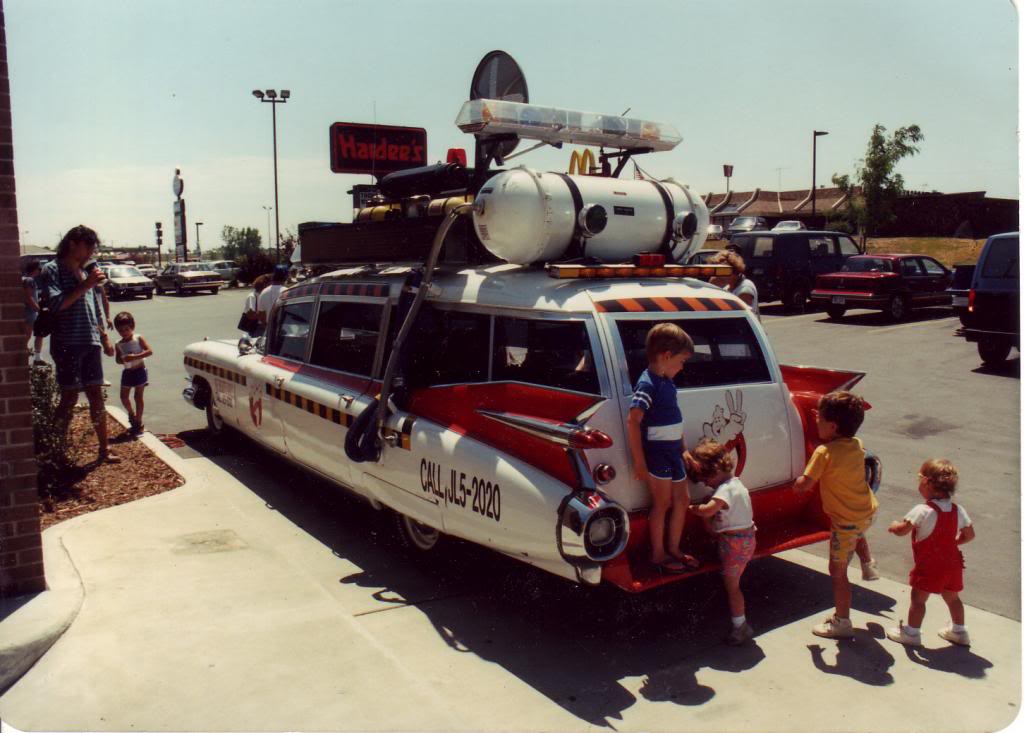
The side tanks, which are now faded white, look like they might have been yellow (similar to the Ecto-1). The tank labels look like they might be red.
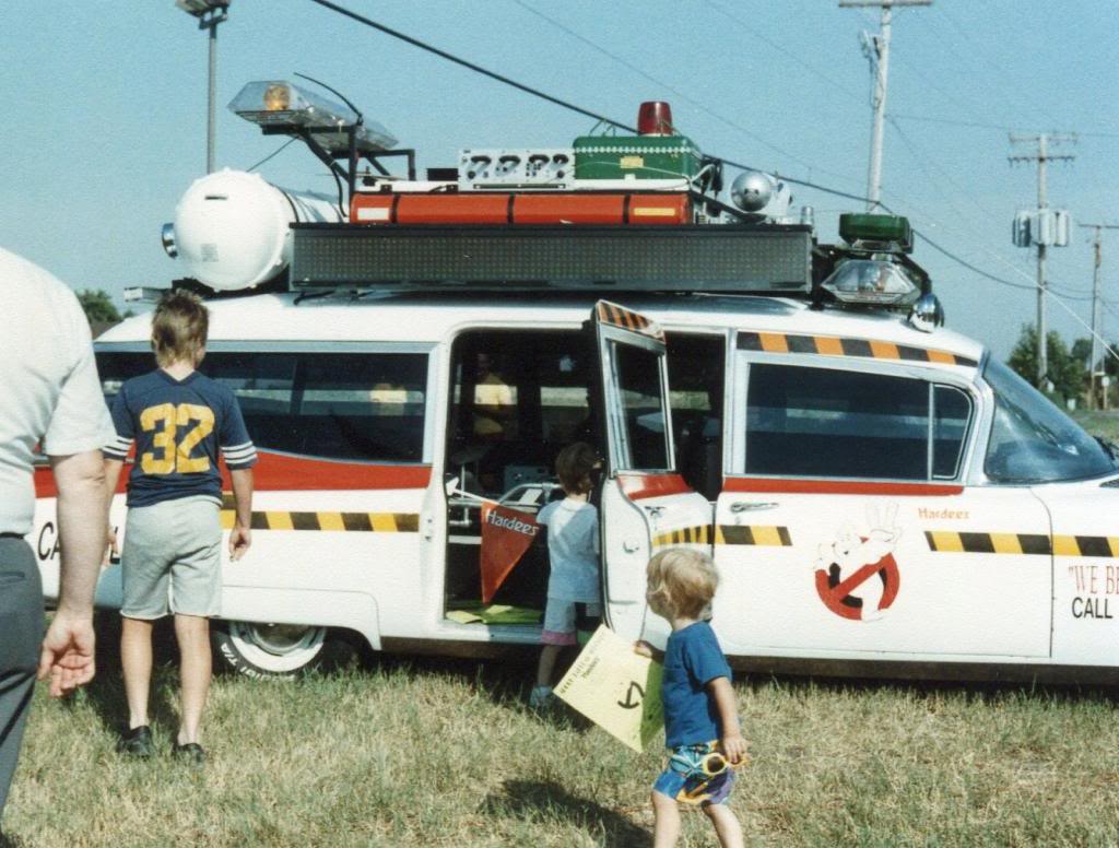
The white label on the far left end of the red tank is illegible to this day. Don’t forget the screen-accurate “Hardee’s” logo on the passenger-side door. :wink:

I’m going to start by redrawing the “WARNING - THREAD SAFETY CHAIN…” label. Any further discussion would be greatly appreciated, particularly if there are some details that aren’t easy to see, or if I’ve given misinformation of any kind in this thread.

Wow, what a monumental undertaking. :shock:

I quickly looked at Dean’s car in AZ, and it doesn’t look like it will be much help. At one time, I believed it to be “the most accurate 1A tribute ever built.” But it seems to be ahem… missing quite a bit. Very few, if any, of the labels appear to be visible, and much of the equipment is wrong anyway. :frowning:

Google will only provide so much, so hopefully people (Alex?) have some old pics in albums they can scan and whatnot.

Cheers, my friend!

You’re going to need multiples of nearly all of the decals as most are used more than once both on the interior and exterior of the car… but more on that later when I’m not headed out the door…

image

image

image

image

image

image

image

image

image

image

image

image

image

That’s the plan.

So far the following labels appear multiple times:

Safety Chain x3

Black and White Rectangular label x4

Electric Shock Hazard x3

Side Tank Labels x2

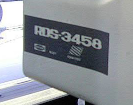
RDS-3458 x2

I haven’t really touched on the interior labels yet. Fortunately there’s good reference material for those, except for that one on the console behind the driver/passenger side.

Thanks for posting those - there were a handful of images that I haven’t seen before, particularly of the upper front section of the rack.

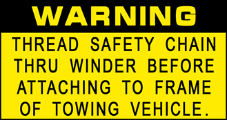
Here’s my first attempt at the “WARNING THREAD SAFETY CHAIN…” label:

…and the original:

Any thoughts or criticism would be greatly appreciated.

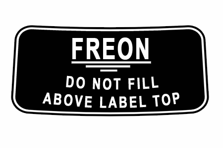
Here’s the “FREON” label:

…and the original:

On the “thread safety chain” sticker, there are a couple things that look a little different to me, not sure how easy to fix.

  1. Can the black text on yellow background be just a point or two smaller? It looks to me like there is slightly more yellow border to the text on the original label.

  2. The font on the original “warning” looks to be slightly rounder. Looking really closely, the “thread safety chain” font looks more square in the original. Almost like the fonts were switched? Or is this just an illusion based on the bold typeface on “warning?”

I applaud this project.

Interesting - I was thinking that the body font on the version I made was a tad too thin. I’ll have to tweak it in Photoshop and see how it looks.

Here’s a version of the Safety Chain label on the Sniffer of Ecto-1 (pre-restoration). The body text is definitely square, but I’m not sure about the “WARNING”; it looks like it might also be square. If anything I might space out the letters in “WARNING” a bit.

Specifically, I was looking at the shape of the R and the G (top section).

If the body text were just a tiny bit smaller (shorter, not thinner) , I think your current WARNING spacing would match up just about perfectly. But it really doesn’t have to be too much.

Freon looks pretty good. Is that something that you could/did work with Martin (drcaron)? - edit: It looks like Martin’s does not have the white border around the text. Carry on…

Yeah, I’m really not set on the R or G that I’m using - I’ll have to take some from a different font.

I just did the Freon label this afternoon. The label on the Ecto-1A is slightly different from the one that was originally on the Ecto-1.

I never noticed it before, but the new labels on the restored Sony car are pretty inaccurate (along with the many other liberties that they took during the restoration).

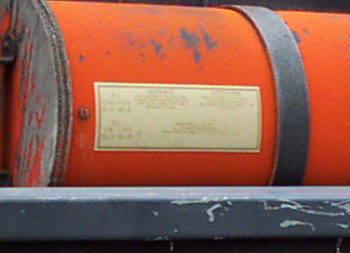
This was the clearest photo I could find of this label, but the text is still illegible. However, the lines and spacing can be seen, so it would be easy to make up some information to go on it. This photo was taken when the car was still at Universal, so the text is (hopefully) still legible to this day and not too faded. The overall look of this particular label reminds me of a bank check (even though it’s obviously not).

This is very likely a “FLAMMABLE” or “COMBUSTIBLE” label, as I’ve seen similar labels with a red and black color scheme, often in a diamond shape.

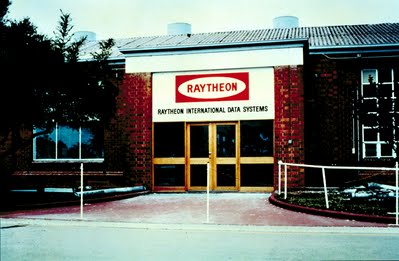
The bottom portion of this label is too small to discern from this photo. Searching a bit on the internet, the wording “Raytheon Data Systems” came up, which shouldn’t be too much of a surprise, considering the prop-builders’ use of Raytheon parts on some of the props. The “RDS-3458” seems to refer to some sort of toner cartridge produced by Raytheon.

EDIT: The logo in the lower left corner is clearly the Raytheon logo:

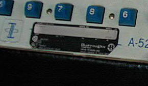
Again, I’m not too sure about this label. Fortunately it’s inside the car, so it shouldn’t be too badly faded or damaged. The logo on the far right looks like a “B” or “R” on a white circle. This label seems to appear on three different points on the exterior of the car.

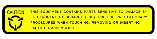
I finished the “ESD” label today:

…and the original:

The text at the bottom of the label is just too small to read on any of the photos, so I cheated a bit:

…and the original:

not to derail the thread, but i does anyone know what the sliver/grey train track looking thing that wraps around the green box?

Not derailing at all; any discussion on the roof rack is welcome. :wink:

I’m really not sure; it looks like some sort of track or tread for an industrial machine of sorts, but that’s a pretty broad guess and doesn’t really narrow it down. Or better yet, what about the origin of the green box itself?

i always wanted to make that green box for some silly reason, but that track just throws me off. The origin of the box itself ? not sure, you think the yellow was a lead to what it use to be? i cant tell what type of material its made from.

Looks like fiberglass to me.

Something about the green box looks oddly familiar; I’m probably way off, but it reminds me of the top covering for a houseboat engine, which were often made of fiberglass and hinged to allow access to the motor from the deck.

Good to see someone tackling stuff like this! Since you’re looking for feedback I thought I’d echo what some have said about the warning label, the fonts are incorrect, not at my computer at the moment so I can’t give suggestions for specific fonts at the moment. Paying very close attention to the details of the fonts on each will be key in my opinion.

Also, I’d recommend that these should be created in Illustrator or some other vector based software for maximum flexibility. Photoshop means they are limited to the resolution you create them in or smaller and can’t be easily cut or plotted on vinyl as would most likely be the end goal for most.

Just a couple suggestions. Keep up the good work!

Thanks for the feedback, everyone. I’ll admit that I haven’t used Illustrator too much, but after playing around wit hit a bit, I’ve gotten the hang of it. I should have a revised version of the Safety Chain label up tonight.

The font for the “WARNING” section is proving to be a bit tricky.