Now that that’s out of the way and alot of people are on the defensive… Let me try and explain the point of my posting this? I think alot of the designs I’ve seen for the different franchises are REALLY well done and add some character. I’m sure the members of the franchise enjoy the logo and in the end, that’s what counts. I’m not going to try and change anybodies mind, I just want to know when this started and why?
I would have thought the standard logo was untouchable. ‘If it ain’t broke, don’t fix it’ sort of thing. I would’ve thought a city embroidered under the patch or a seperate patch on the other arm…?
It reminds me of Star Trek: The Original Series. Every ship had it’s own logo… until ‘Starfleet’ just decided to use the Enterprise logo- The one we all recognize as the Star Trek logo. I’m genuinely interested in finding out the reasoning behind the altered emblems? Are your uniforms even sporting these logo’s, and if not- why?
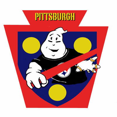
well, I won’t “cross the streams” on you for having an opinion. Different franchises do it to give it their own identity. We have 3 technically. The first is from the (fictitious) Pittsburgh Ghostbusters started by my wife and I in 1992.
The ghost has a Steeler shirt with 5 superbowl rings, and black lines under the eyesfor football. The red keystone is for Pennsylvania, the blue and yellow shield is for Pittsburgh.
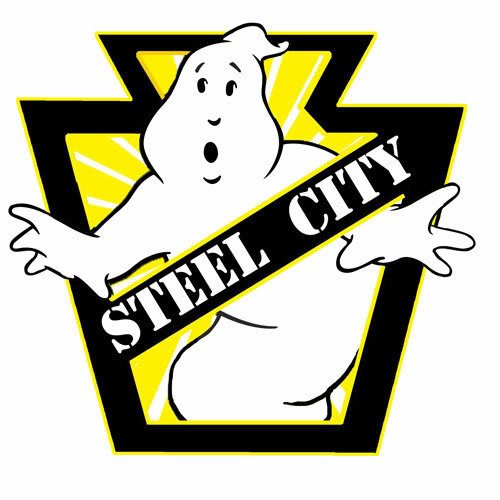
This is the Steel City Ghostbusters Logo, the franchise that bought out my old franchise in 2002 (fiction). Dave Swartz (OAOSwartz) sketched up a design and I did the Photoshop and a guy named Max Morrow did the white art deco stuff inside. The Keystone is the same with a black and gold motif for Pittsburgh.
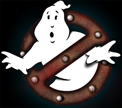
This is our new logo that is on our balck and gold uniforms we get at the end of our fan-film. It was designed by Brett Whitling who is a member at large going to Clarion college. It was easier to make our own custom patches this way from Katarra8’s regular “no ghost” with metallic fabric paint and brass grommets for the rivets. We are from the “Steel City” after all. : )
For us it comes down to simple identification, regional pride, and letting people know you’re not trying to be the actual Ghostbusters, but you’re the (insert name here) Ghostbusters. We put velcro on our patches so we can switch between the regular and our custom logo. Regular for 80’s themed events and Halloween, ours for charity events.
Mine’s not a franchise logo, but it was one of the first altered logos (maybe the first? were there any earlier ones?) Jay’s CDN GBs was about the same time (which I remember, cuz I did a version of it for them.)
Mine grew out of the original third movie premise - Ghostbusters in hell. I made a mock poster with the logo on fire with “now hiring”. That movie dragged on forever, so eventually I just made it the site’s logo, eventually giving it a proper graphic treatment - replacing the PS “realistic” fire effect with art flames.
As Jeff said, it’s a local identifier. Just having the names under the patches is kinda dull and isn;t very nifty. Although I agree with why it shouldn’t be altered, making a custom patch and logo is more effort placed into the costume showing a little more dedication to the franchise aspect of the design. Any Joe Shmoe can buy a No-Ghost logo at 5 bucks and iron it on, but the time it takes to alter a logo and make it into an actual patch takes some doing. I mean…
That took some doing on my part. When people see it, they get all excited and ask what does it represent outside of it being the Ghostbusters logo. It’s fun to explain that we’re not just generic Ghostbusters, but that, “we’re the (insert city/state here) Ghostbusters”
Wow those designs are excellent, can someone tell where you can make your own GB logo, I am doing a fan fiction franchise team that is based in my hometown of Pittsburgh.
There’s already a team in Pittsburgh, the Steel City Ghostbusters. I think how it works is the city cannot have more than one franchise. I may be wrong on that, but I think we’ll leave that to Dan and Co.
We haven’t been really strict since I’ve been at GBI about “one franchise per city”–counting fan fiction franchises, there are three in New York City (GBNY–the original and Extreme Ghostbusters; GB Arcane Division; and Nightsquad)
On topic: the neon orange GBWC logo, created by TheRazorsEdge, can be seen prominatly on the splash page of our web site:
I agree to an extent about leaving the original logo untouchable, but i also like the concept of the franchise logos as well, so my personal opinion usually involves having the franchise logo, on ID badges, and other stuff but leaving the logon on the uniform untouched… which is how LVGB is.
But other franchises love their designs and they all look great, I think, so more power to those guys.
Hah! I’m coming to that area next week to visit the Martin Guitar Factory in Nazareth! Small world. Sorry, wild tangent…
These things look great! Were I to be part of a franchise (I’m for hire! :P), I’d probably wear the franchise patch on my left arm or upon an ID badge - something of that nature. I’m all for doing whatever you think is fun, though - That’s the important part.
Funny, I think that’s the first time I saw your logo. Cool! Just goes to show you how you can have two logos with keystones and be different at the same time.
yeah and the blue and yellow color scheme is very prominent, especially here in Allentown, The Allentown Police use those colors, so I figured it would give the logo a sort of Law Enforcement type vibe, like Ghost Cops. lol