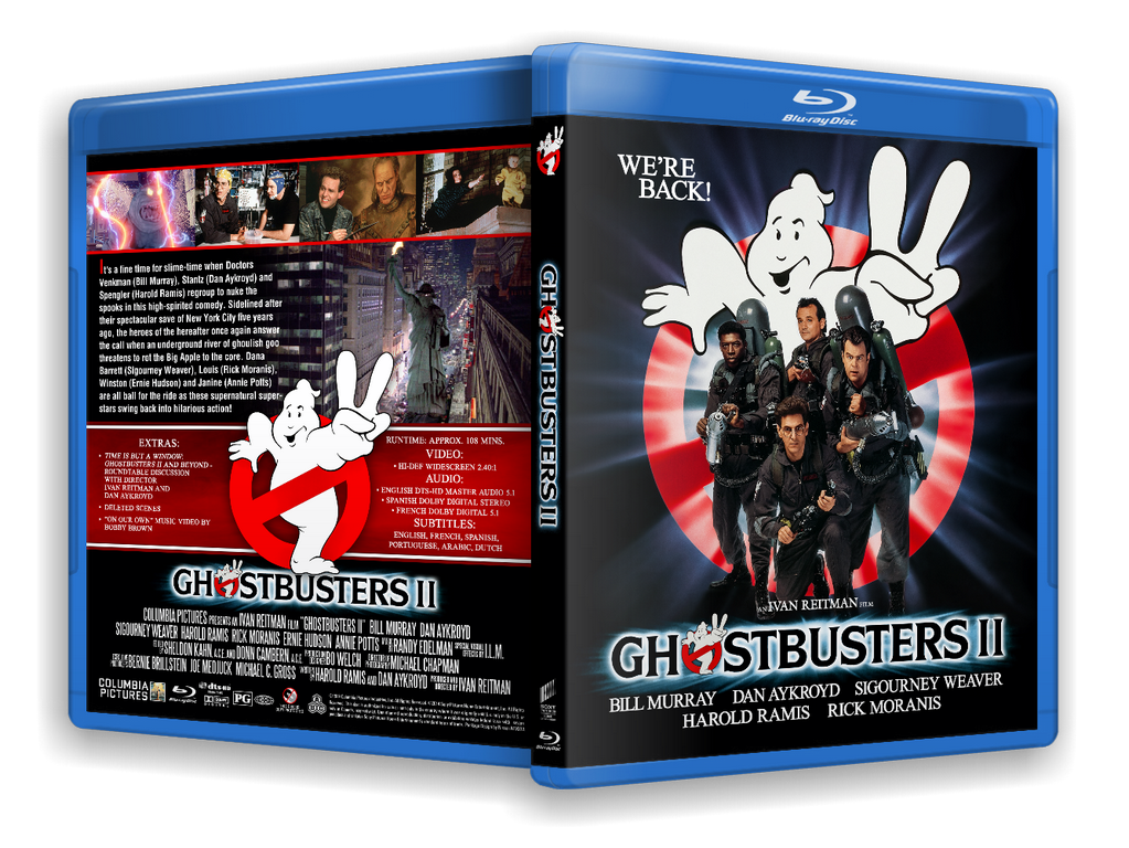
Decided to try my hand at making custom covers for the Ghostbusters I and II Blu Rays since the covers they gave us look…kinda…crap. Anyhoo, hope you enjoy.
Those look great imo. I liked the blue cover with logo we got butcthoseckook awesome great job.
Thank you.  To be clear, what I said about the blue covers was just my opinion. I’m thinking of doing a variant of these covers without the retro distortion on them. Either way, thank you for the kind words.
Those are great! Would be interested to see the non distortion versions too! Lovely to see the proper cover art on them.
Thank you for the kind words. I’ll try and post the clean versions today. There’ll be bigger versions on my deviantart page if anyone wants them
As promised:
I’ve been looking for custom cover art that I can put into a single tridisc blu ray case reminiscent of the GHOSTBUSTERS and GHOSTBUSTERS II box set that came out around 1990 when GB2 was unleashed to home video. It was a basic design. It had a somewhat small but prominently placed no ghost logo and the “o” in Ghostbusters had the 1st film’s no ghost logo and the second one had the sequel logo in place of the “O”. That design is and always has been perfect! I don’t know how to make custom cocver art myself. I’m sure it’s easy as pie if you have a ton of money but I’m 100% broke 85% of the time being unfit for the workforce as it so happens to be (the other 15% of the time I’m 85% broke). I don’t know if there’s a post that quenches this desire or not…I’m one of the more reserved GB fans out there…
What is butcthoseckook?
The designs look good, though unfortunately the font used for the logo is the extremely inaccurate one floating around at the moment.
I think that’s the one ppl use to avoid copyright infringement lawsuits or DMCA takedown requests.
That’s one possibility, although given the cast photos, the Columbia logos, the no-ghost logo, there are bigger attractors of legal ramifications than the font.
And that’s assuming it is a “get around the copyright” one, rather than it just being a loose approximination.
Anyway, I just felt that as you’d gone to such an effort to replicate the classic design, it was worth it to update the logo strap font in order to maintain the excellent standard you’d set.
Any font geeks in the house? What style font does Ghostbusters 1 & 2 utilize? I’ve always loved it.
It’s a serif font, however either it was produced using a font that’s never been digitised, or it was a custom job made exclusively for the film, as it’s yet to be identified outside of the Ghostbusters franchise.
Though there are some places where you can get good reference for the font, which can then be translated into an element in Photoshop:
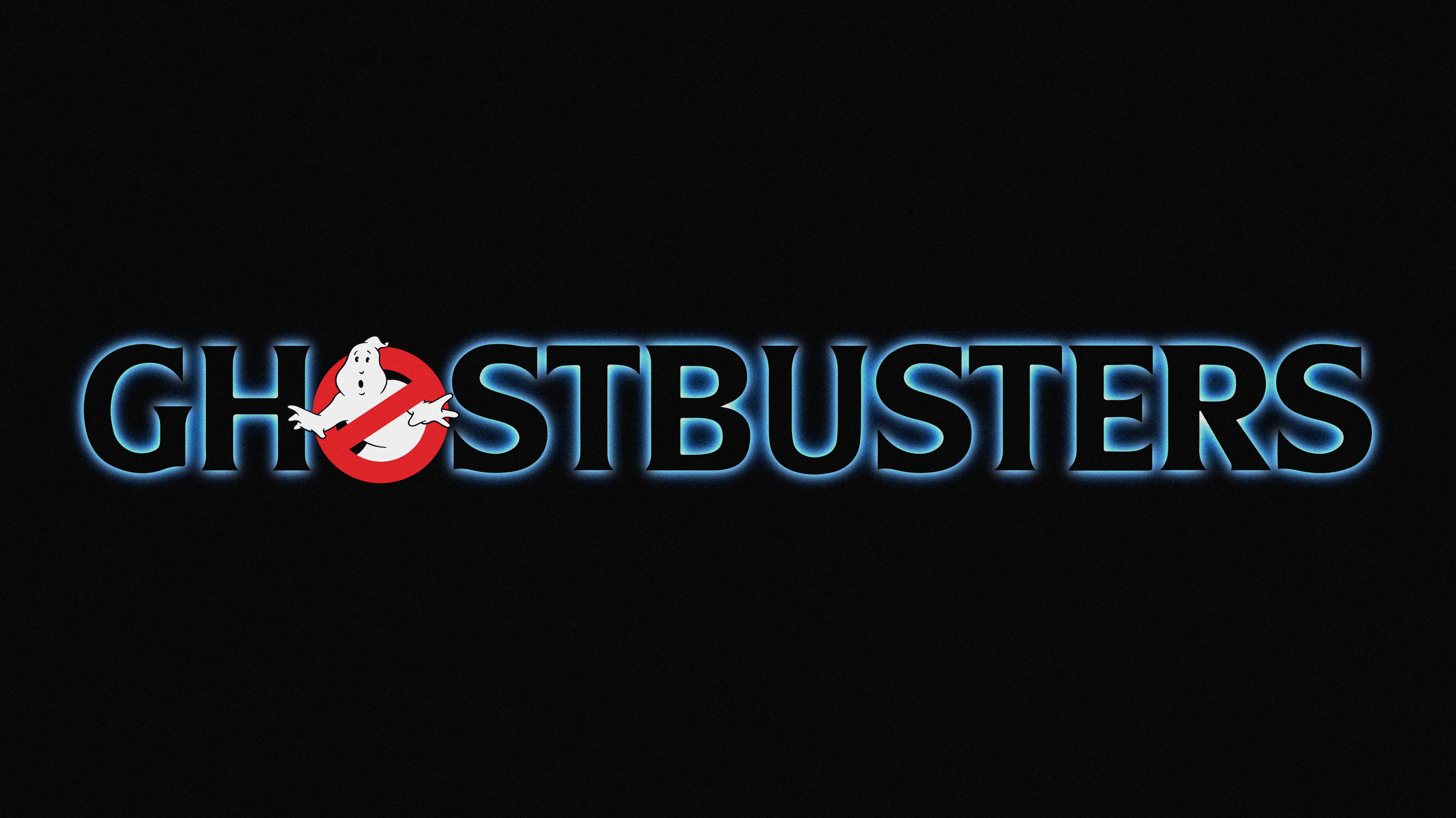
Does anyone know where to get this cover design with the correct font? There’s a lot of stuff to sift through. I’ll keep looking and post it here if I find it.