Thanks for the brilliant shots of the sign Alex, I really appreciate the time and effort you have put into this. Ironically it has just made my job a bit harder now, I thought I had almost got it right, but now when I look at the shots you have provided I can see there are more alterations to be done. I will post some more progress pics when I have made the alterations. Thanks again
Sorry Alex. Can you be a little but more specific and precise? 
Kidding, your attention to detail is awesome! I would have never noticed that the 2 wide shots were the same.
Here’s another angle from Entertainment Tonight’s film premiere footage:
Source footage here, but there isn’t a whole lot of the sign to see:
Not likely to be very useful, since I myself have always wanted a head-on shot. But I figured I’d add to the pool of images at least.
Nice detective work, groschopf!
The ET footage for the making of GB2 was also handy for a closeup of the WKRR 12 logo on the side of the ‘world of the psychic’ studio cameras when I made this diorama:
We should check that ET footage more often.
Alex
Just concentrating on the nose, do people agree that it is only raised on the bottom and the left hand side, the right hand side seems to blend and is not raised.
Most likely it’s raised on both sides and the bottom (triangular shaped). I think you’re being thrown off by the angles, lighting and shadows which are different in every picture.
In the pics Alex put up, side A shows the light running down the side of the nose, this indicates that it is raised, but in the pic of side B which is taken from the opposite side you can see the light in different areas but there is no light on the nose, which indicates that instead of there being a definate ridge like the left hand side, there is a gradual slope leading upto the left hand side. Also in the ET pic this is more obvious. What does everyone else think?
Yeah, I see what you’re talking about. It almost looks like a cresting wave… gentle slope on one side, hard edge on the other.
Alex
Quick update ! Here is the latest offering, I think i am almost ready to vacform. As always any thoughts or suggestions are welcome.
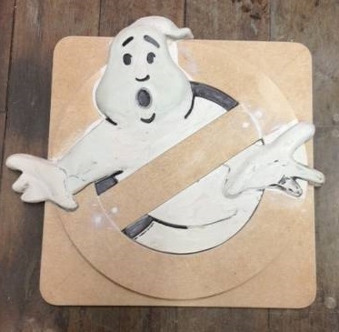
Is it the angle of your photo, or did you tilt his head to the left (his right)?
I agree with Cap. The head looks like it got shifted about seven degrees counterclockwise.
I know it’s a lot easier to fix the photo than the real buck, but if you could just nudge it back to about here (exactly seven degrees in my software) I think it would look perfect.
Alex
Hi to everyone and thanks for the suggestions. Just before i chop off and adjust the head i thought i would post another pic from a similar photo angle to see if it does need adjusting or if it is just the angle of the photo i had taken.
Comments welcomed as always.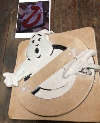
I hate to say this, but it still seems a little off to the left.
Yes, it definitely needs adjusting.
Here’s a bit of photo manipulation to try to illustrate why.
If we adjust the horizontal and vertical perspectives of the movie frame, and also skew, stretch, and free-rotate the image, we can get the square borders of the sign a little closer to being perfect right angles.
Now, this of course does all sorts of crazy distortions to the curves of the ghost, so I only want you to focus on ONE area… the upper right part of his head that runs along the black line I added at the noon position. See how well it corresponds to the vertical left and right edges of the square?
Above is the B side. Now let’s use the exact same techniques on the A side.
I didn’t quite get all the edges vertical, but still you can see that same part of his face is lining up with the vertical.
And finally, here is the same set of manipulations done to your photo.
I only put part of the ‘noon’ line on this one, so as not to obscure the white part.
As you can see, you actually HAD the head in the right spot, as indicated by the white area on the circle. But at some point, you rotated it counterclockwise. About seven degrees.
So although I totally understand your hesitation about altering the sculpt, it does need to be corrected before vacuforming from an incorrect buck.
It needs to go from this…
(where he’s looking slightly ‘downhill’)
… to this:
Alex
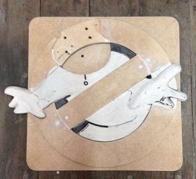
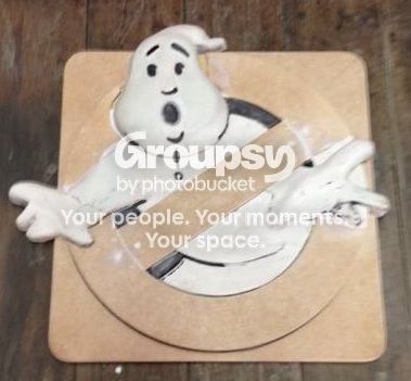
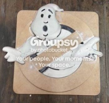
In my humble opinion, much better.
Contented siiiiiiiiigh…
That looks SO much better! Thank you!
I should also say, I beg your pardon for wanting that ONE detail fixed.
But the reason was, this thing looked so beautiful and perfect in EVERY other detail, it was literally the only possible thing to tweak.
Can’t wait to see what you do next.
Alex
Thanks Alex and CaptCyan for the kind words and help with the detail. So now all that is left is to fill in we’re the adjustments have been made, then it’s the bit I like best which is vacforming. Stay tuned ?
Can’t wait to see the first pull.