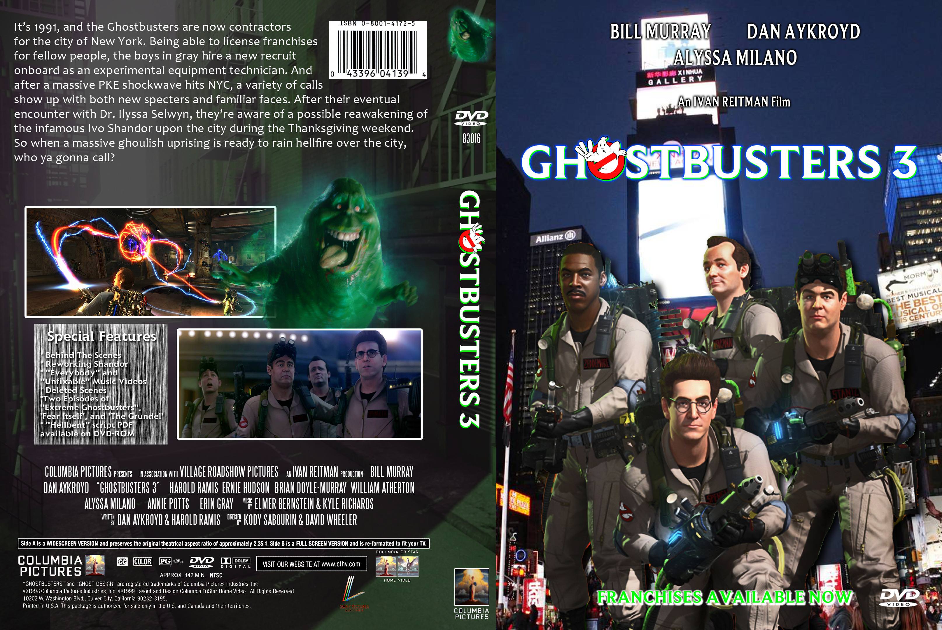
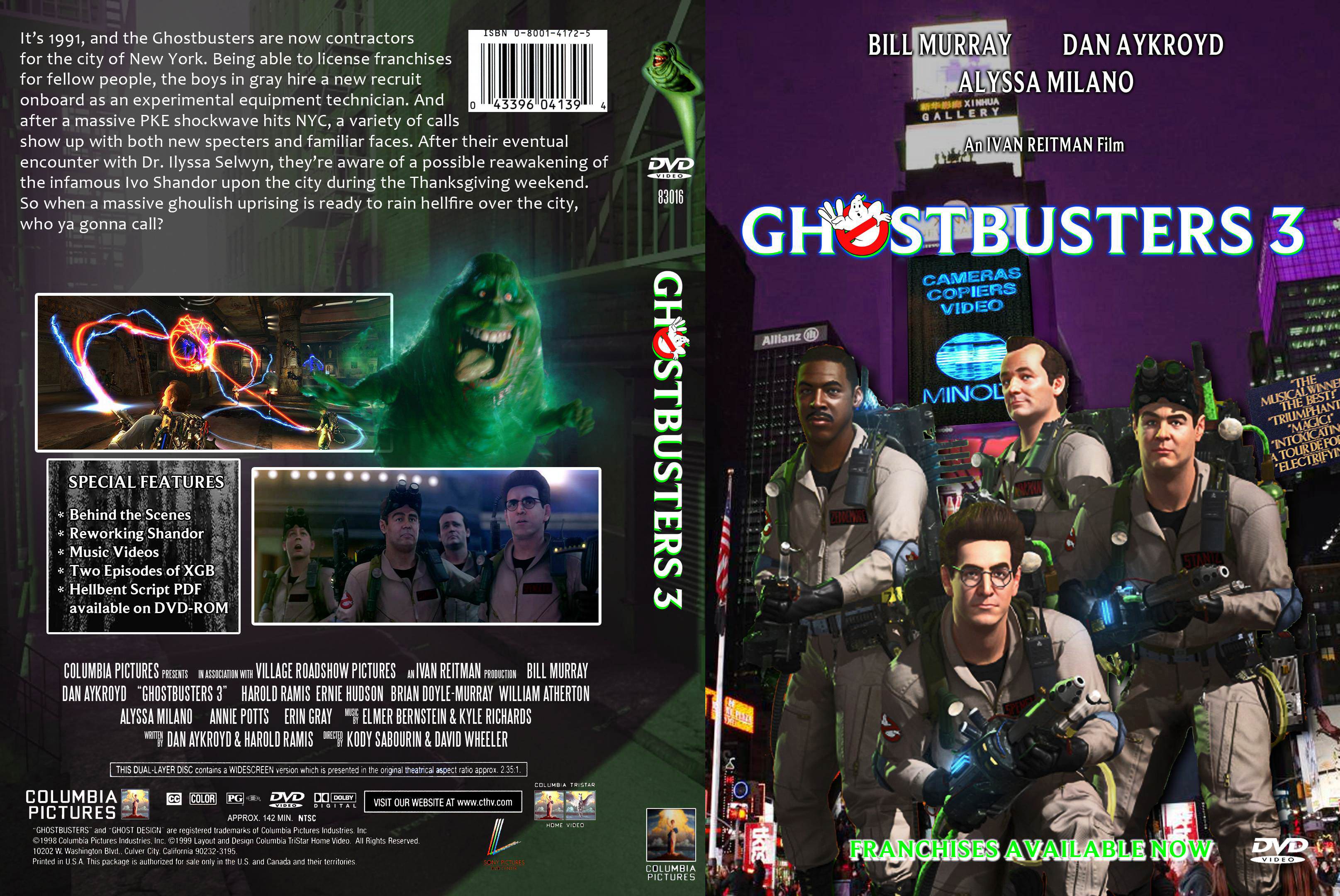
Hey, I’m John. The guy who went to Comic Con and won a Playmobil RGB Peter Venkman set from the Stay Puft San Diego photo contest. Anyway, I’m satisfied with the 2009 video game and the 2016 movie, but I still wanted to convert the video game into Ghostbusters 3. There was that edit from a couple years ago (and I have it) that could be used as the footage. I have a boxart design right here:
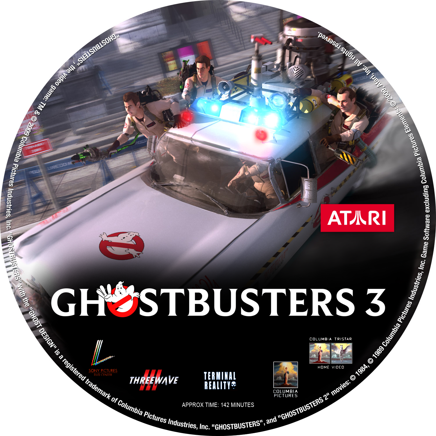
It’s in the style of the 1999 DVDs of the first two, so it feels appropriate for its time. I have a disc label edited together, but I’m not using it until I get the DVD finalized. Here’s the label anyway:
Got this off CustomManiacs and felt like this was good enough for the GB3 vibe. Anyway, that 1998 text is a reference to how there was Ghostbusters 3 credited for 1998 on the original DVD of Blues Brothers 2000. The font I used for the title is actually Beaufort Bold, not that publicly available ■■■■-hat of a font. From what I could tell from the contents, it could fit on a basic DVD-R disc or a DVD+R DL disc. Anything else that should be contributed? Let me know, and thanks for reading!
For me, Dan Aykroyd, and for many others the game really is the real GB3. Well, real as in a sequel to GB1 and GB2 and tying the stories together. ATC kind of stands apart on its own. This cover kind of makes that reality come true!
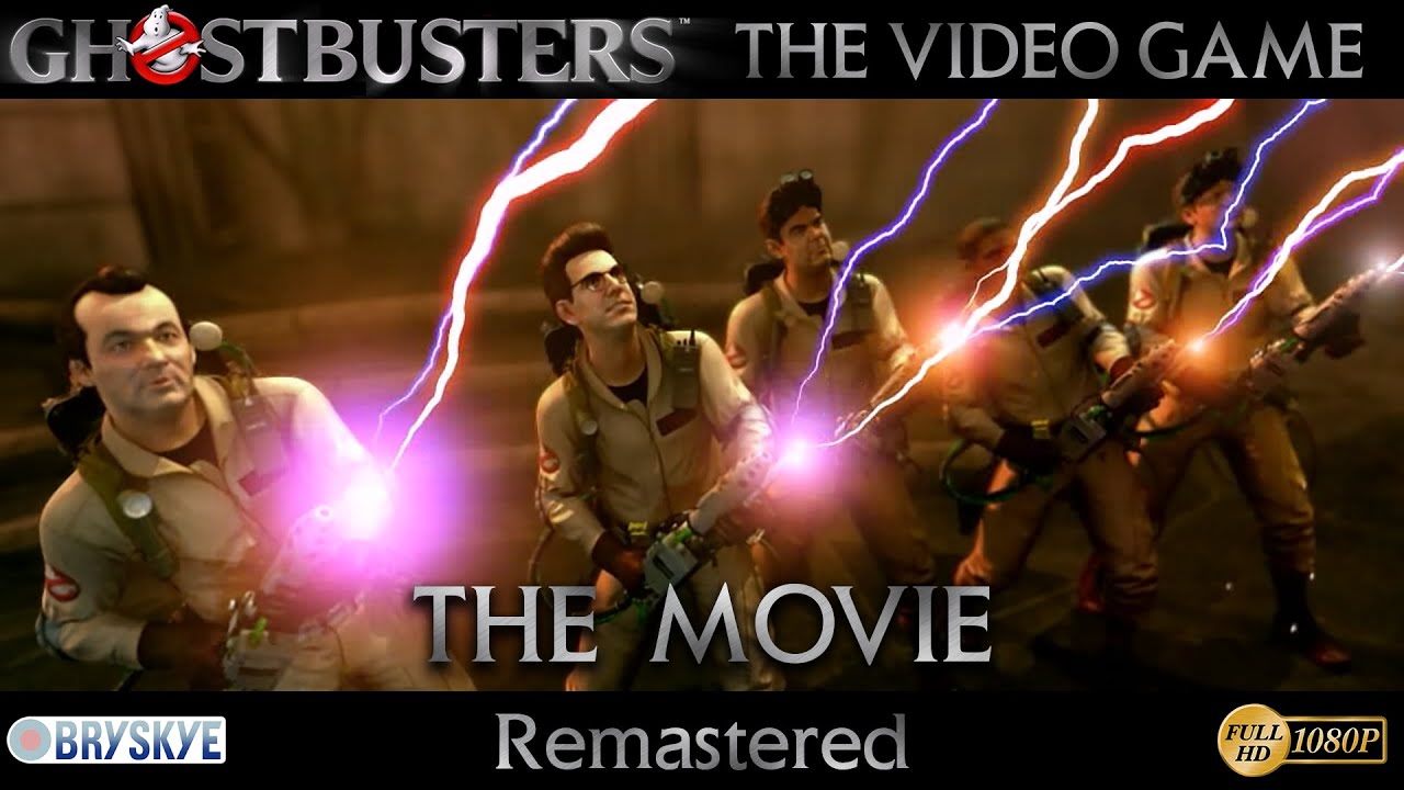
I think this version (The Remastered Cut, not the Extended Remastered) is the best version out there. It uses HSAA aliasing.
PS: Though I think it should have featured the Pumps - Ghostbusters theme on the box art somewhere. That song is considered the “unofficial” soundtrack of GBTVG by many fans. I’m not familiar with the “Everybody” and “Unfixable” music videos, what are they?
Two songs I just think work with the vibe. Backstreet Boys and Will Ryan (DAGames/Diamond Armada) respectively. I’ll add the Pumps theme to a soundtrack listing at one point. Thankfully, I can change the cover to include some of the new stuff. The music vids are along the line of how certain movies have music videos of the songs recorded for them, and the GB2 Blu-ray including the On Our Own music video. If things don’t work out, I might remove them, or at least one. :whatever:
The Pumps song was actually commissioned for GBTVG by Terminal Reality. It was going to be used as the main title track and feature on TV ads for Ghostbusters: The Video Game. Kyle Richard from Terminal Reality helped with the mix and added official Ghostbusters: The Video Game sounds into it. Until one day Sony decided that because Pumps was not signed to Sony, the game wouldn’t feature the song afterall. The developers at Terminal Reality were sad that they couldn’t use it, so there is some genuine history with GBTVG.
On a “official” cover like this I’d stick with the “official” songs, because everybody’s tastes are different, but that’s me. To reiterate, the cover looks great!
If I can offer some constructive feedback: Maybe it’s missing some pink and purple shades in the color balance but that’s my opinion. I think the GBTVG palette was heavy into green, pink and purple (judging from the color of most ghosts and the equipment in the Shandor Island slime factories scenes).
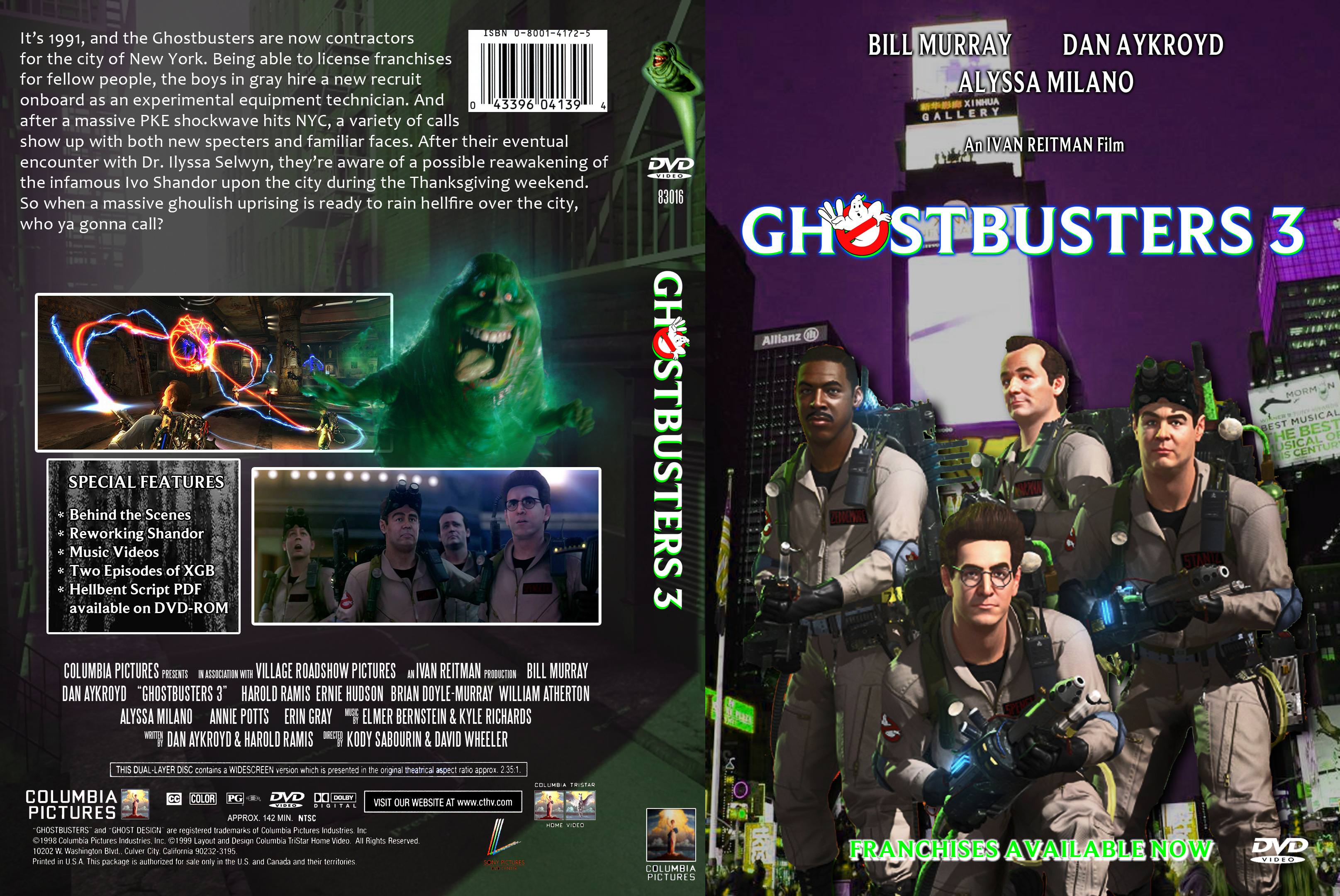
All right, the front shot of NYC has a purple tint, the spine has the correct render of Slimer, the Special Features blurb is updated, and that Side A text is replaced with the Dual Layer stuff from the GB1 DVD.
The back cover says “It’s 1991”… but on the front cover you’ve pasted the quartet onto a photo from 2011 at the earliest, since a billboard for The Book of Mormon is visible.
Was there no ‘Times Square’ shot from the game itself that would have worked for a background behind the posed GBs?
Okaaayyy, the front cover now has a relevant (to the movie/game) shot of NYC. It even has that blur into the back cover’s shot of NYC. Thanks for lettin’ me know about the inconsistencies, Alex.
I believe the term XGB was not an official name so would not be used on an official product.
I prefer the first background (2nd, purple version). I feel that the composite cutout of the guys works better (looks more realistic). It also says “New York” more than the last version. And NY was a character in GB.
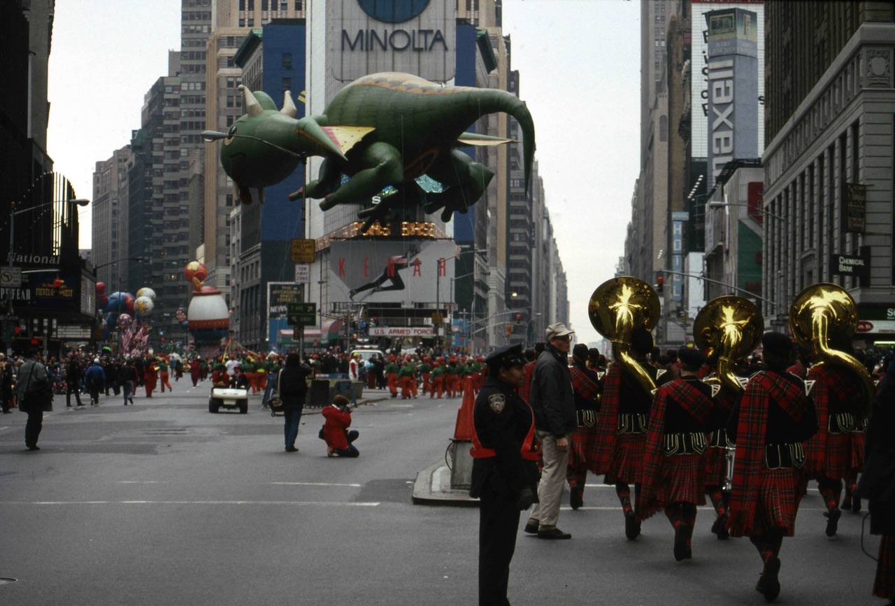
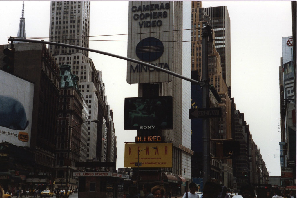
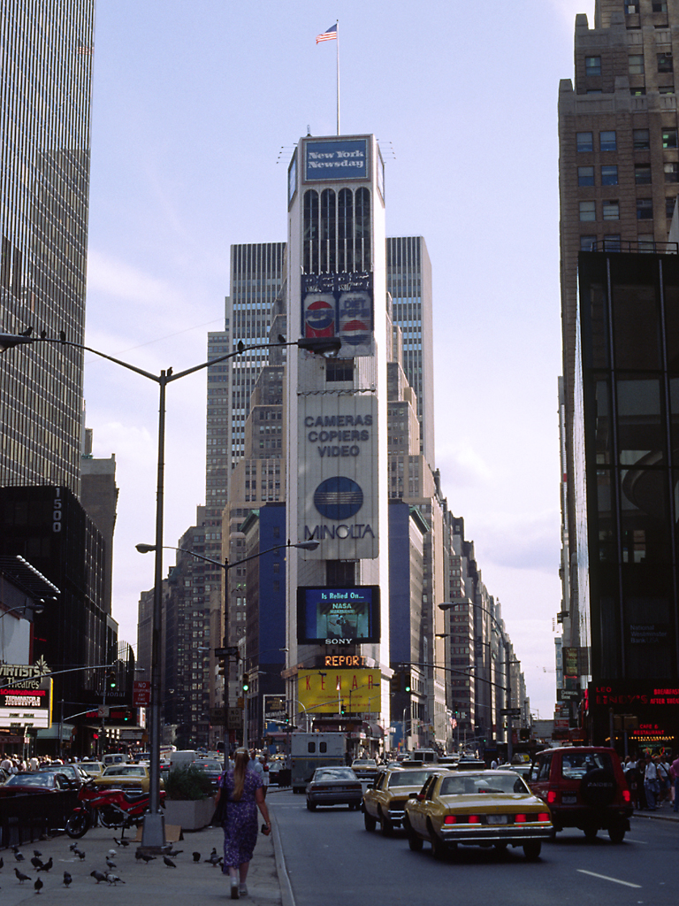
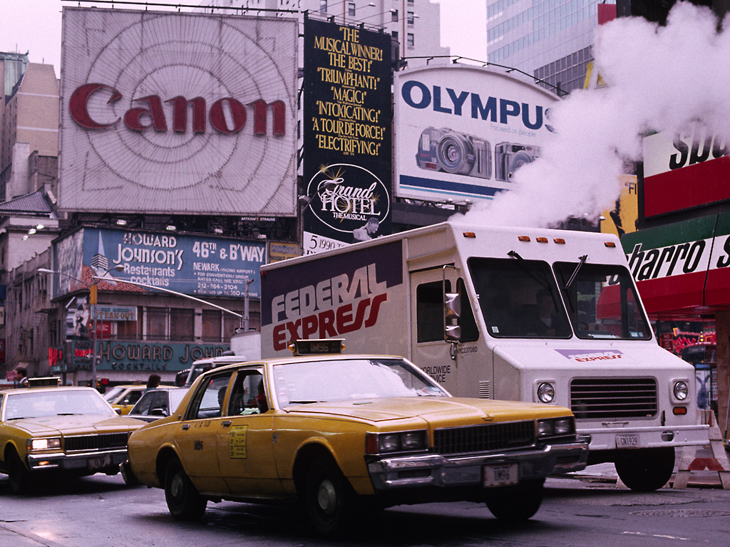
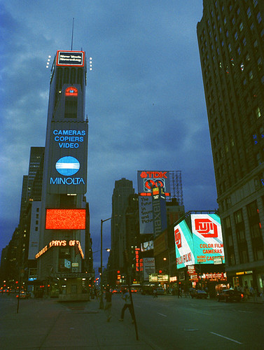
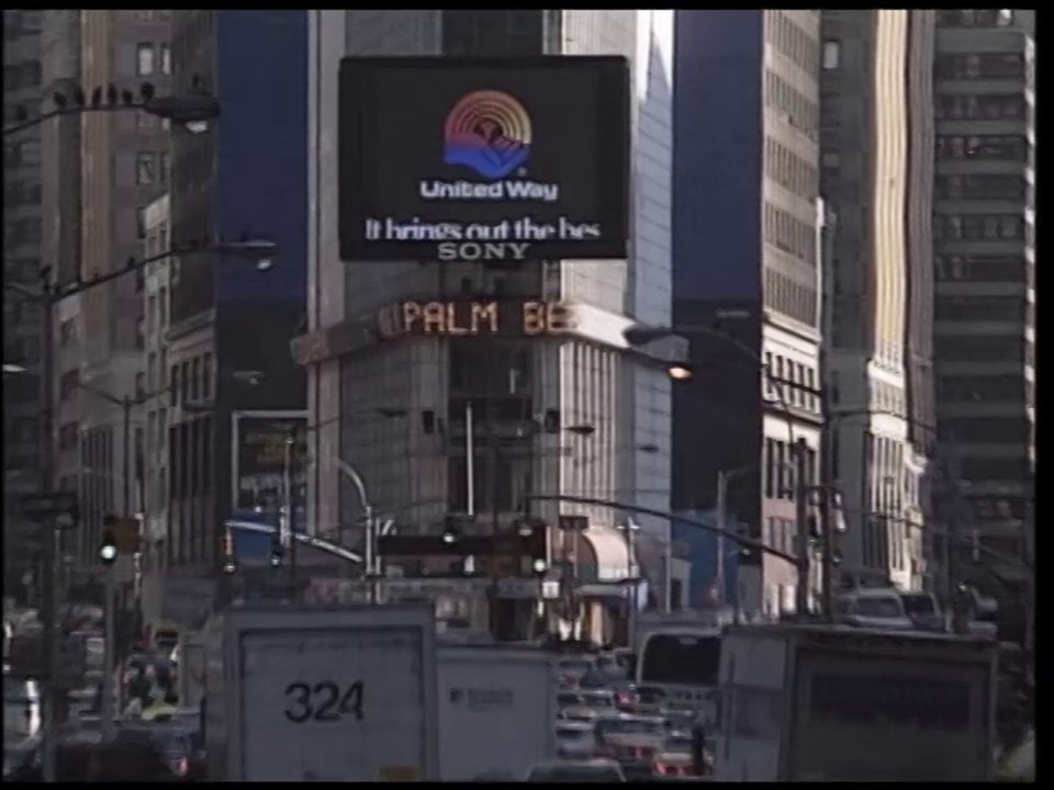
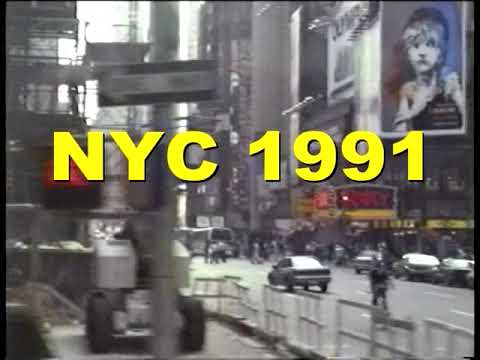
These are pictures taken of Times Square in 1991. Perhaps you can use the logo’s and ads to fill in the big empty ad on the second one and the anachronistic ad on the right.
These two videos confirm there was a huge Minolta sign there in 1991.
06:35s
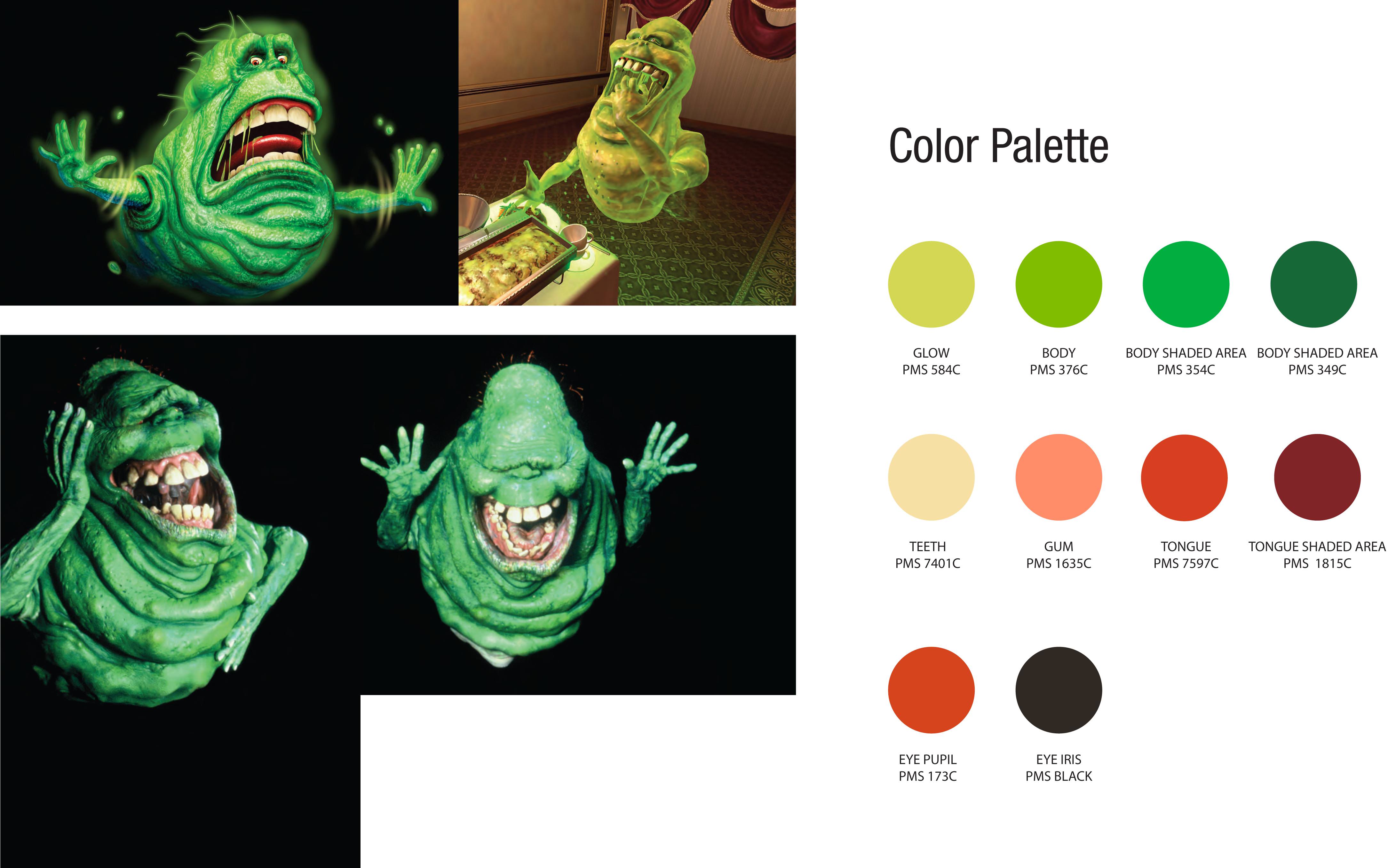
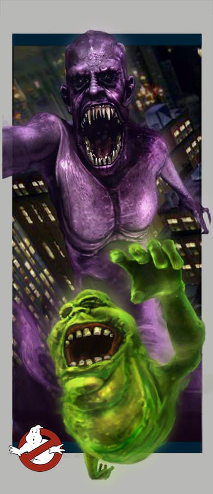
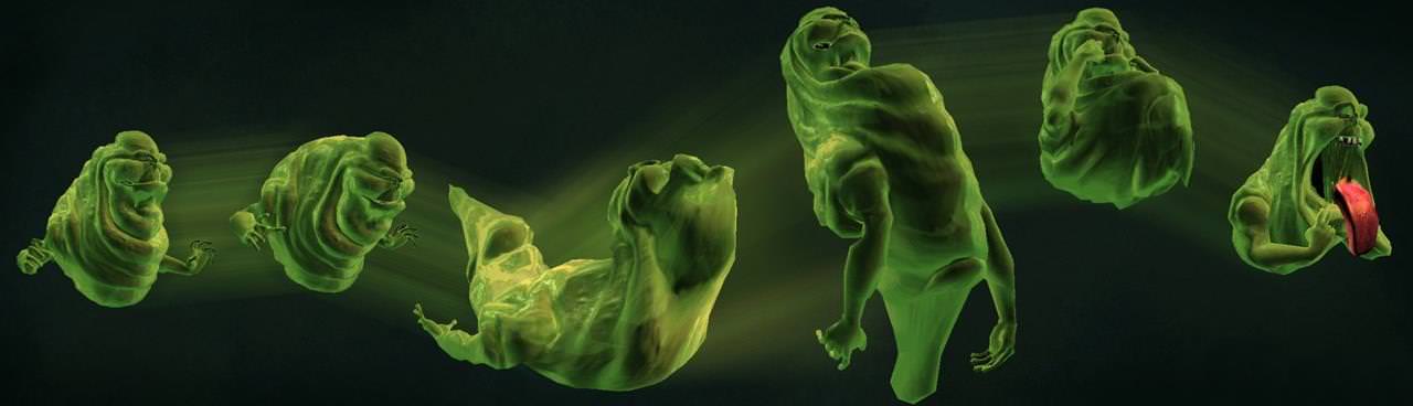
Also I searched for some official GBTVG assets if you want to replace the 2016 ATC slimer with a VG specific version. I don’t think you need to but incase you want to. I found these:
I was having loads of problems just typing the bonus content on the back of the cover, although I do remember the XGB acronym being used in a commercial for the show.
It’s kinda too late to revert the backgrounds back to the last one, since my Photoshop file now has the current BGs of this and the layers were merged. Maybe I could rework the backgrounds altogether with the ones you showed me.
Thanks for the suggestion although I’m quite fine with what I have here. Fortunately, I do have the correct Slimer render on the spine
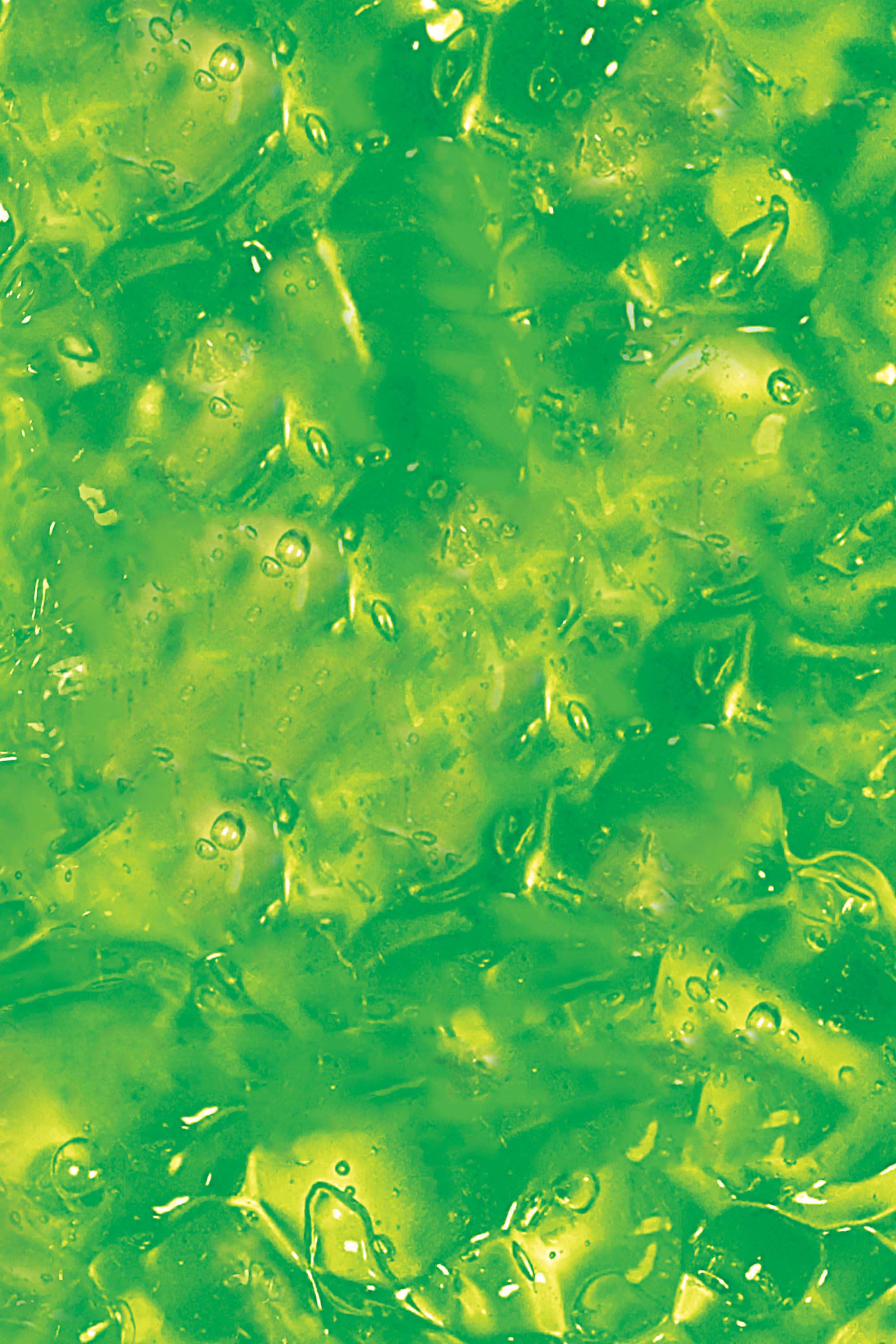
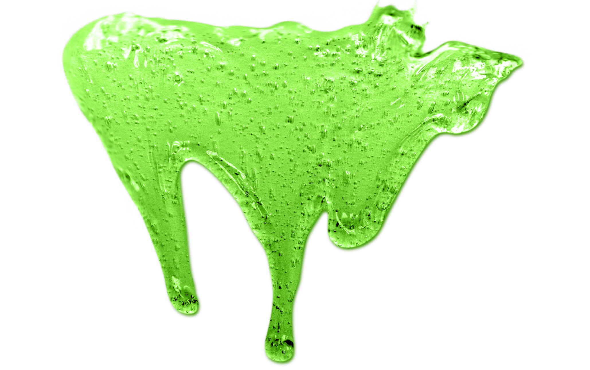
On a side note, I have the artwork for a soundtrack CD prepared. I’ll print it out for a jewel case and get the songs prepared soon. I also have interest in doing a 2005 style DVD boxart. You know, the slime covers? I just need the proper slime background for it.
Thanks for the quick edit. Now I don’t need to worry about the boxart anymore. Anyway, who knows where that slime background from the 2005 DVD comes from? I have another PSD open, ready to make the 2005 style. And for the disc label, I’m definitely gonna try to replicate that sketch effect. I think it’s easy.
I’m happy with what you did, One time. And thanks for the slime assets. If I can remember how far I got on the 2005 DVD, I got the logo, title, credit text, and cast names on. I gotta continue it later since I’m at college now. As for now, thanks for the help, everyone.
Lyrics from the theme song that didn’t make it into the episode intro, but did crop up in show publicity included a reference to XGB. You can hear it (as well as see a couple visual references to “XGB”) in this commercial:
I know it’s too late to change, but I would definitely suggest going with one of the historically correct 1991 shots of Times Square, even if it doesn’t quite reflect the look of the area in the game… And I’d ditch the green/purple hues that’ve been utilised as they don’t really make the photo look like the game.
Yeah, it kinda is, unfortunately. I do admire how One time helped out with the signs in the front cover, but I honestly don’t want to go back to constantly changing the shots of NYC. It’s a LOT of trouble just to make a decent cover. So yeah, I’m finished with the 1999 and 2005 covers. I still got the soundtrack and discs (both DVDs and OST) to finish.