https://twitter.com/paulfeig/status/618605859241918465/photo/1
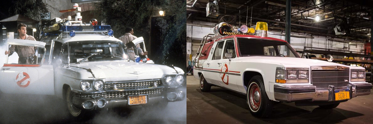
One big light instead of a bar, also see they decided not to use blue for the light.
https://twitter.com/paulfeig/status/618605859241918465/photo/1
One big light instead of a bar, also see they decided not to use blue for the light.
If you check Feig’s new Twitter icon you can also see the ghostly hood ornament.
oh my god that yellow light is awful lol
Only the yellow light? Just look at the door bar thing.. crosses over the Ghost. Just looks terrible overall. Really looks like one of those really bad replicas.
Wow, iconic.
I’m so, so glad it’s an old POS and not some shiny advertisement for an as-yet-unreleased model.
Not digging the single yellow light in the middle or the trim covering the logo on the side, but everything else about it is fantastic.
Ugh… no no no no no NO! I was doing so well in staying positive about this movie… but… but… THIS is an abomination! Ugh… Heck, most of the Ecto clones out there look better than this!
Pretty sad when you look at them side by side  I think pretty much everyone can agree what one’s cooler. This thing looks more like a clown car
This is a sad day indeed. 
It’s the Bay Area GB’s car!
This can’t possibly be real! While I’m excited for this film and have been enjoying the new designs, this car is an utter joke.
To me it isn’t bad. It definitely isn’t good either. Just extremely and I mean EXTREMELY lackluster. At least its still a hearse though right? … Guys? … GUYS?! Don’t leave …
It looks like something I can actually build! I like that!
But everything I build looks like shit.
This could be the Ronald McDonald mobile. The McEcto.
When you first see the original Ecto, you’re in awe, it looks amazing, you look at it and YOU WANT IT!
This…? HELL NO! I think every fan agrees they can build a better Ecto than this…
It looks like a 1991 model - 25 years old, just like the '59 MM was 25 years old in 1984.
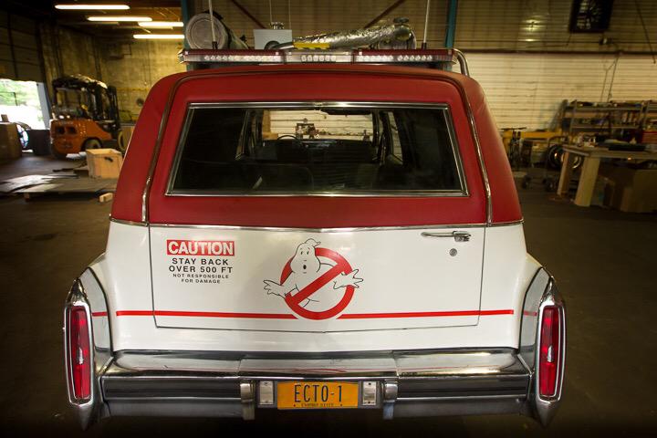
Clearly, they pay attention to the fan community, no matter how much people might disbelieve that at the moment. Check out the logo on the back of the car.
Sure looks like Sean Bishop’s stomach/arm tweak in the logo.
I think it’s a 1984 cadillac superior hearse. The '91 has chrome trim that goes around the wheel well and the front bumper goes back further.
I don’t like the line over the logo. Wonder what that’s about.
Other than that, at least this car is accessible unlike the ultra rare 59 ambulance.
i feel like this whole movie has a built on a shoe string budget and more function over form feel. meanwhile the quirks of the characters in the first is what MADE the props feel great, Ray was over enthusiastic so he bought a car that looked cool rather then one that functioned perfectly, and Egon made the packs out of things that served purpose with the science of the time (nuclear) and out of things that made sense for the time from a scientific point of view, even the sniffer was something that if any other character used it would have come across different. I think him releasing all this prop info before we know the characters is a BAD thing. If Kate McKinnons character is as punk rock as shes looking, then i could see her character slapping together a car like this. Not saying i support the decision or design, but i think that the character of the people means more the the look of the props and thats why the originals are so great!
A few things that would improve the look:
Add the black background to the No-Ghost symbol.
Remove the door molding that goes through the center of the No-Ghost symbol.
Ditch that ugly yellow beacon.
Replace the hubcaps - the white walled tires and chrome hubcaps really don’t make any sense on this car.
A pool ladder? Really? No ladder would probably look better.
I don’t want to seem negative, but this really looks like one of those awful Shriner Ectomobiles.