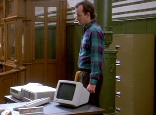
Brown and green are kind of an odd combination.
Can we switch them to something more compadible?
Brown and green are kind of an odd combination.
Can we switch them to something more compadible?
Nope.
i think anything else would be too loud
:lol: :lol: :lol: Perfect response. :walterpeck:
Shane
No. It still looks awful. This is a place for site feedback so I gave it. A more respectful response would have been nice.
Well just because you don’t like it doesn’t mean it looks awful nor does that mean that it should be changed.
Not only does it look fine but Zack pointed out it served a purpose.
Don’t give an opinion and ask for feedback if you don’t wanna hear anything that doesn’t match your view.
fyi: Brown and Green and very nice complimentary colors. While they are certainly compatible, I am not sure they are compadable.
If you really think any of the above comments are unreasonable or blatantly disrespectful, I suggest you take a break and do some self evaluation. By internet standards those response are quite tame, I would not even classify them as mild outside of the internet.
But this is the second time this week I have seen you take a snarky attitude simply because someone did not praise what you said.
No, I’ve given a snarkey response when I’ve been given a snarkey attitude to begin with. It had nothing to do with praise. I don’t see you responding to the people who comment that the slime I used on my xbox looked like ■■■■■. Other than that, I’m more easy going than you give me credit for.
And when someone just says “no” with no explanation behind it or just showing a picture, that can be construed as rude.
Again, this is supposed to be a place for feedback so I gave it. If you guys didn’t like the question then don’t have a place where people cas ask it.
I was going to back you up, but if you have ■■■■■ on your x box, then nevermind.
Ok, dude, that was funny. ROTFLMAO
Someone gave you a three out of five stars and you berate them for it? Sound familiar? You better check-d-y check yourself before you wreck-d-y wreck yourself.
Yes there was a reasoning that it was similar to the theme of the firehouse. That was all I meant. The green brick texture, I just think there’s a good chance you’re greatly outnumbered in this thought.  It’s very easy on my eyes personally.
Sorry my picture of the Ghostbusters firehall interior scheme matching the color scheme of the Ghostbusters website was so disrespectful
this thread is giving me squirty dumplings
I’m with you EU
I don’t like being told to change my site design.
However I will gladly change the design if someone comes up with something better.
Don’t go changin’…to try and please me…
Seriously, though, it’s great. My first thoughts, too, were WTF is the brown and green for?? But it makes you think, and after you do some research for proton packs and the like, and stumble onto a shot of the interior of the firehouse, it all adds up! I say keep it, and let all those wondering why it is what it is try and figure it out. It’s very clever.
The look is ok, but to spice things up, every time you click a link or button on the site, can you program
it to make hilarious noises like a donkey naying, or an explosion, ■■■■ sounds, or a lady sighing? that would be awesome.
Of course these are just things I came up with on the spot, with more time, you could come up with even better stuff.
I thought the crown molding trim work, the fire pole on the main page, and the brick pattern made it sort of obvious - but thats just me.
Actually I wasn’t “telling” you to do anything. I just made a suggestion. I get the idea behing your motif now I’m just not partial to the combo on the site. Dosn’t mean I’ll stop coming here if you don’t listen to me. If you’d like, I can give you some sample suggestions.