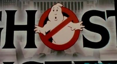
I have been wondering what the deal is with the screen used logo at the beginning of the movie. Was that the original logo, and they decided to polish it later on? Or was it just how it turned out when they animated it and they just didn’t bother to fix it?
They did kindof the same thing with the GB2 logo by adding a 2nd leg that goes in behind the logo, which actually I preferred over the one-legged look.
^Edit: I just read where the original design had the 2nd leg in the logo, but the design was lost so they had to redraw it, and they simply forgot the 2nd leg ecto-web.org
i’m still blown away that the art department didn’t animate the logo for the title sequence. maybe a union thing? is there a union for title sequence animators? HA…
it still doesn’t explain the inconsistencies in the design…
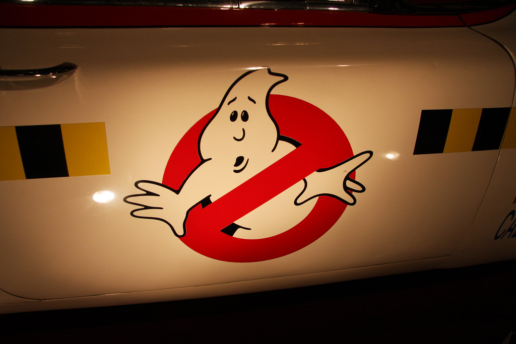
That wins my vote for “worst GB logo ever”, not so much because it’s definitely manure with an adhesive backing but because it’s ON AN ACTUAL '59 CADDY!!! I mean FU**!!! It’s not a Ford Festiva in some parade in Ohio, it’s an actual '59 Caddy that all the hope and ability to be something GREAT!
…and there it sits festering with THAT!!!
It looks like the ghost of a constipated Woody Allen.