sav-c
June 4, 2016, 12:08am
1
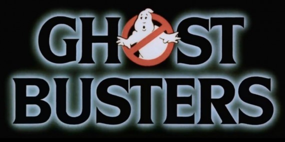
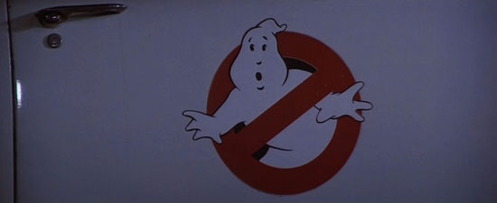
Why is the logo used during the title different from the rest of the film?
Here it is for the first film:
Yet everywhere else in the film it is the familiar logo we all know:
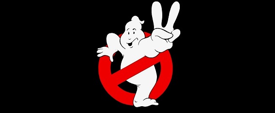
Here’s what the second logo looks like in the title:
But everywhere else it looks like this:
Does anyone know what the reason for this is? Supposedly for Ghostbusters II the design was lost, but I find that hard to believe. I’m very curious to know.
Thanks
Wow, nice find!
I don’t know, but from a design standpoint both later logo’s are more polished. It could be that they tweaked them further during postproduction and before release.
sav-c
June 4, 2016, 1:02am
3
Thanks
The first variation on the Ghostbusters II logo feels like the ghost is giving the peace symbol, but in the second variation it seems to be implying that it is the second movie. At least those are the vibes that I’m getting.
I would imagine it’s just the difference between animation and a static image.
The opening credits were probably made from a different company with different artists.
sav-c
June 4, 2016, 5:56pm
5
You’re probably right. It’s just interesting how the logos are the same everywhere except the title sequences.
The first film’s title animation was by R/Greenberg Associates, Inc.
It also says titles by Pacific Title for both films.
For Ghostbusters II :
The logo used in the movie is unique. Unlike the logo that appears in marketing materials, it is the original, lost design: the ghost has two legs stepping through the red symbol. After it was designed for the movie title intro, the design was lost, so it had to be redone. However, when it was redrawn they forgot to add in the second leg! So it appears the ghost has only one leg, or a funny-looking tail. You can tell it’s meant to be a leg, as there is an indication of a foot and an ankle.
That’s from Spook Central , so I would assume it’s accurate. How they can lose a logo is beyond me.
Could have been a design choice. Oh who am I kidding, someone fix the logo!
sav-c
September 21, 2016, 4:25pm
7
From page 181 of Ghostbusters: The Ultimate Visual History