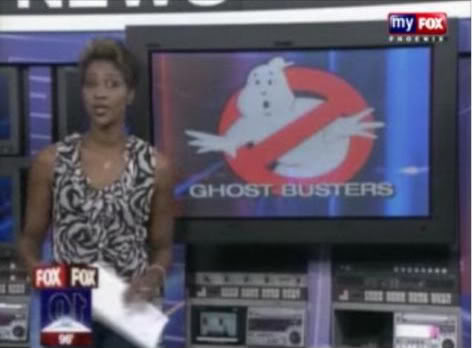
Answer: Very much.
You see? Much better.
Answer: Very much.
You see? Much better.
isn’t the top one from the NES game?
No. It is a badly rendered (MS Paint) version, that for some reason is very popular in knockoff Ghostbusters items (ESPECIALLY on Ebay.)
Real Ghostbusters Online!
is that the logo people are useing on those shirts there selling on ebay?
When we were on our local FOX station a couple of years ago it’s what they used. Which they would used ours instead or at least the original.
Even better:
haha I went looking for that fan fic page, that’s where I remember it from the most.
It’s good to see most everyone else really doesn’t know the difference or I’m sure grabbing whatever logo comes up in google image search works for them.
It’s not like it’s the first result on Google images, either… it’s near the end of the second page of results, with nearly two pages worth of better versions of the logo waiting to be used.
Madness.
When I do a search for Ghostbusters it was my first image result.
Same here.
Kingpin must be using the BRITernet.
Even worst, they click on the first thing they see when looking for source material.
Thats why I enlarged the actual logo ghost for our wreath.. if I’d tried to do it by hand, I’d end up with something “off” like that image.
The devil is in the details.
All over YouTube, too.
Raaaaaage.
Its taking over the internet Frylock.
This is the one that drives me up a wall:

It’s close, but not right. And it’s all over fanmade gear and cars.
Frankly, this one gets me, too.
It’s like they hand-drew that ■■■■■■ Pillow and Emboss setting that everyone used to apply to everything when they first took photoshop class back in 2000. I am not a fan.
I liked that logo, gave it a new breath of life.
I like the new game logo as well as the original clean lineart logo.