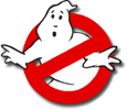
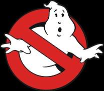
From what I’ve heard on the creation of it is that the ghost looking to the right is the european nations logo. As a slight gag, the U.S. version flipped it to give us the one we all know and love. It talks about it in the booklet that comes with the Ghostbusters/Ghostbusters 2 slime packaging gift set.
He pretty much hit it on the nose. A european sign, turned American. I hear the prohibition logo was actually not very common, if at all, here in the US until shortly after these films. No need to thank these fine Ghsotbusters America, your Visa, check, cash, or money order will do it for you.